Family Living Magazine
Art Direction & Editorial Design
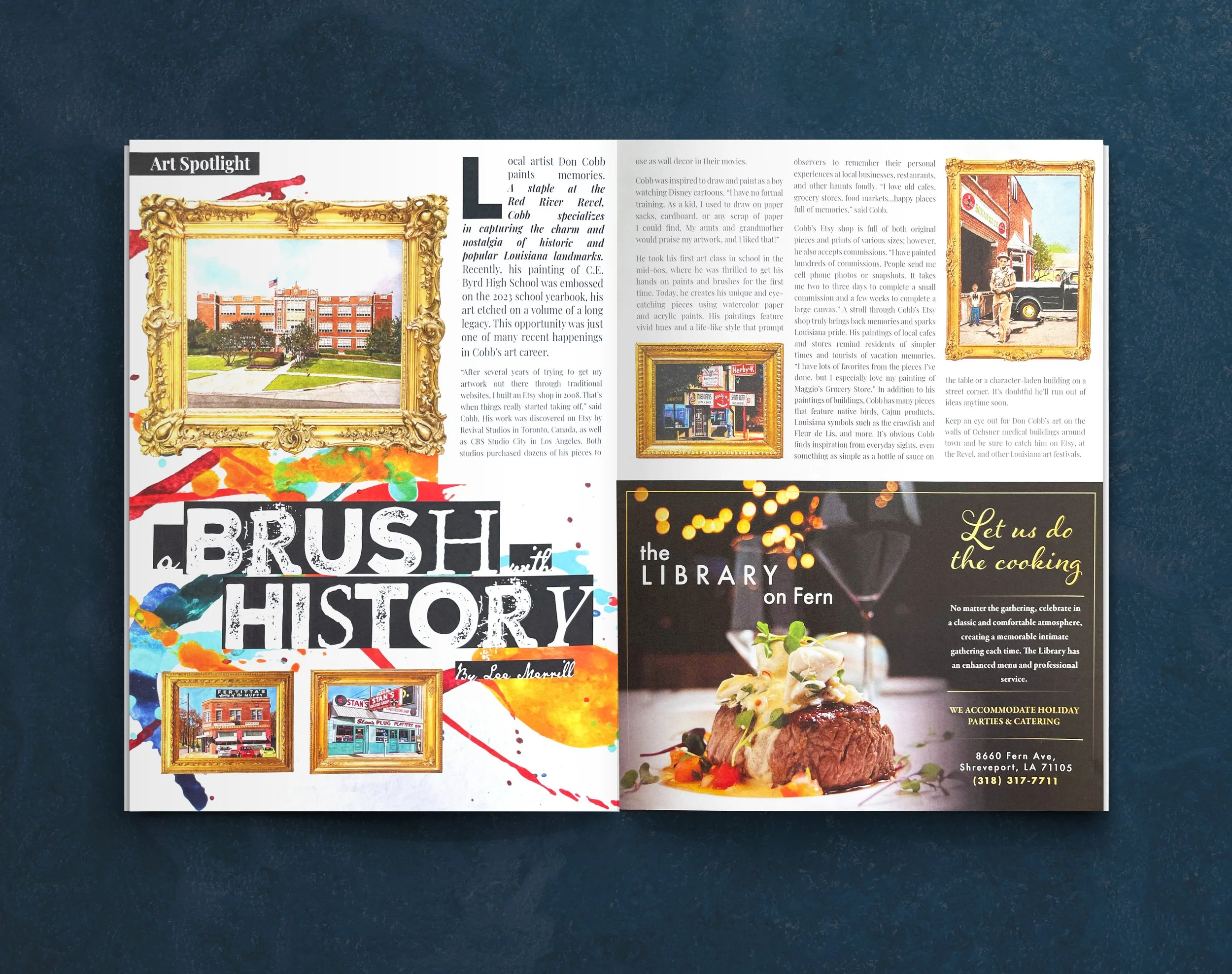
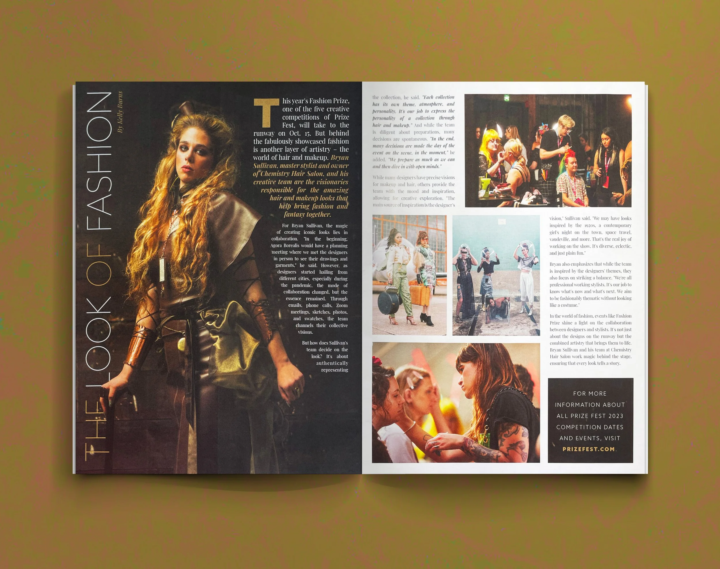
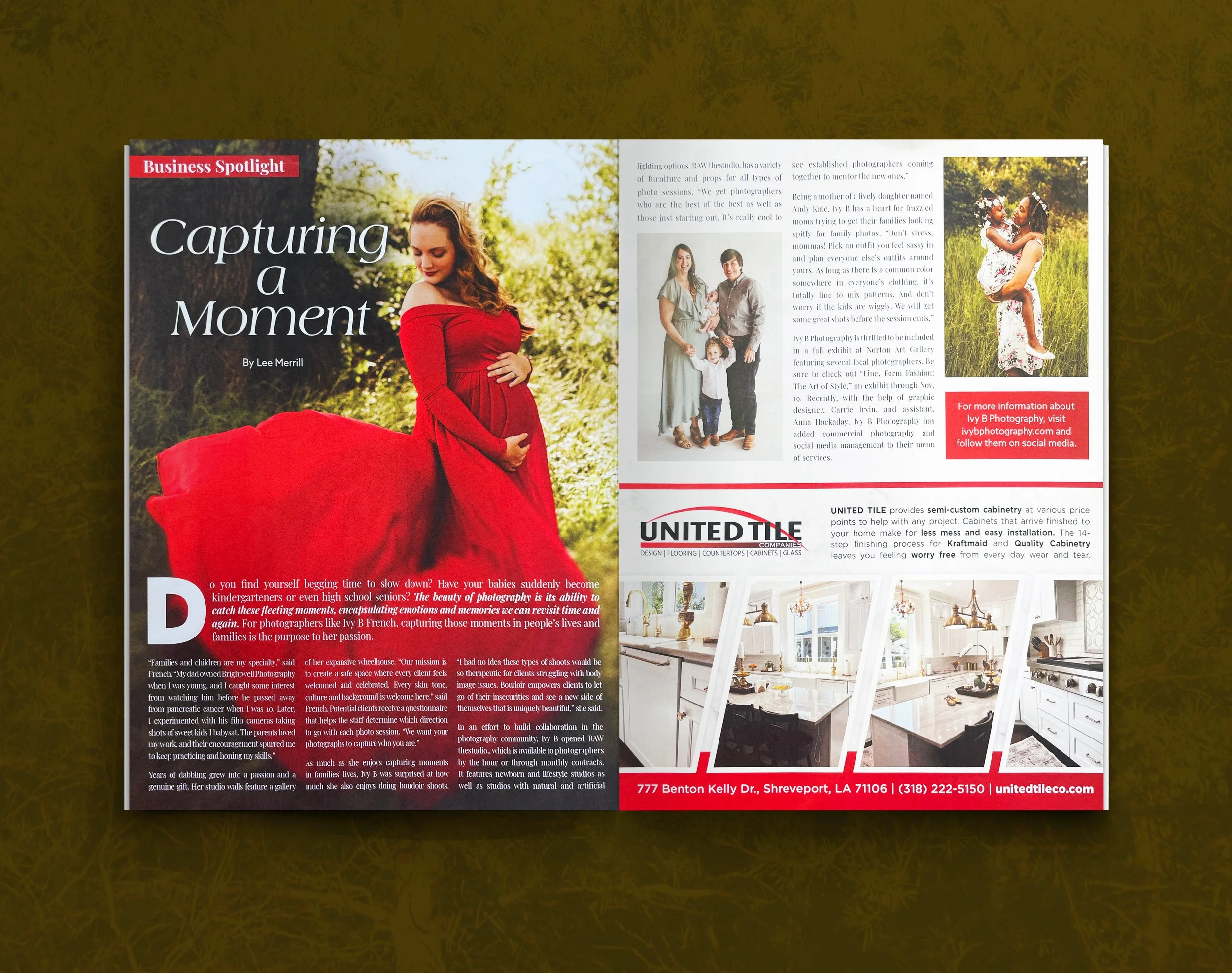
Family Living Magazine is a monthly lifestyle publication reaching over 16,000 households. As Art Director, I led the visual direction across the magazine—shaping everything from cover concepts to feature layouts and advertising integration.
The work required balancing clarity and warmth with a strong sense of structure. Each issue needed to feel cohesive while allowing individual stories to carry their own tone and rhythm. Through typography, pacing, and image selection, I focused on creating layouts that felt inviting, readable, and grounded in everyday life.
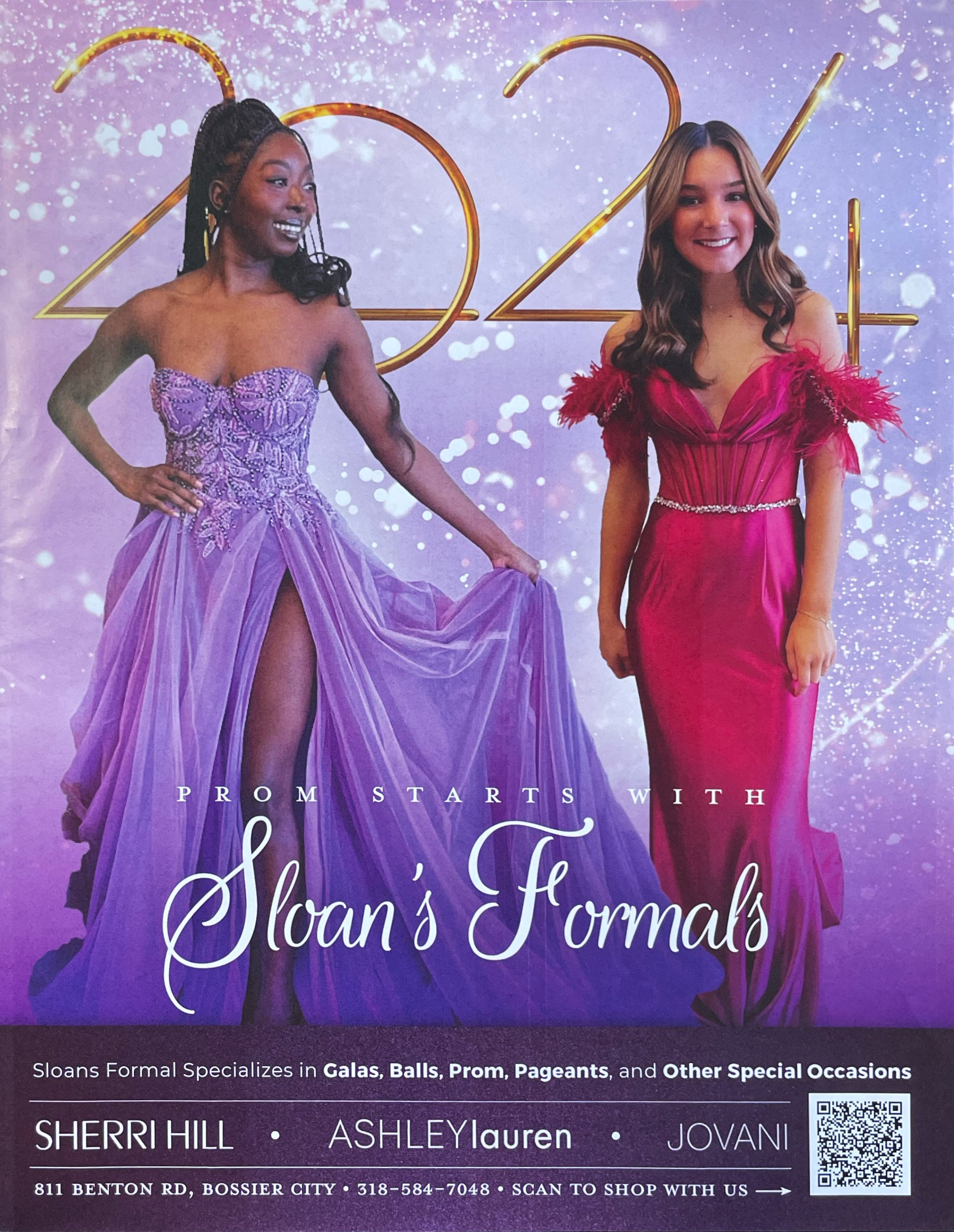
Working closely with editorial, sales, and production teams, I helped guide the magazine from concept through print—ensuring consistency across departments while adapting to the needs of each story and advertiser.
Covers
Each cover was designed to act as both an entry point and a promise—something that could quickly communicate the tone of the issue while standing out on its own.
I approached covers with a focus on clarity and hierarchy, using strong imagery and intentional typography to create a clear focal point. The goal was always to feel approachable and engaging, while maintaining a consistent visual identity across issues.
Story Layouts
Feature layouts were designed to support the rhythm of each story—balancing text, imagery, and negative space to create a reading experience that felt both structured and fluid.
I focused on pacing and hierarchy: when to slow the reader down, when to give space, and when to create visual momentum. Typography played a central role, helping guide the reader while reinforcing the tone of each piece.
Across departments and features, the goal was consistency without repetition—allowing each story to feel distinct while still belonging to the larger system of the magazine.
Advertising
Advertising layouts required a different kind of balance—meeting client needs while maintaining the overall visual integrity of the publication.
I worked closely with the sales team and advertisers to design ads that felt cohesive within the magazine, ensuring they integrated naturally with surrounding content rather than disrupting the reading experience.