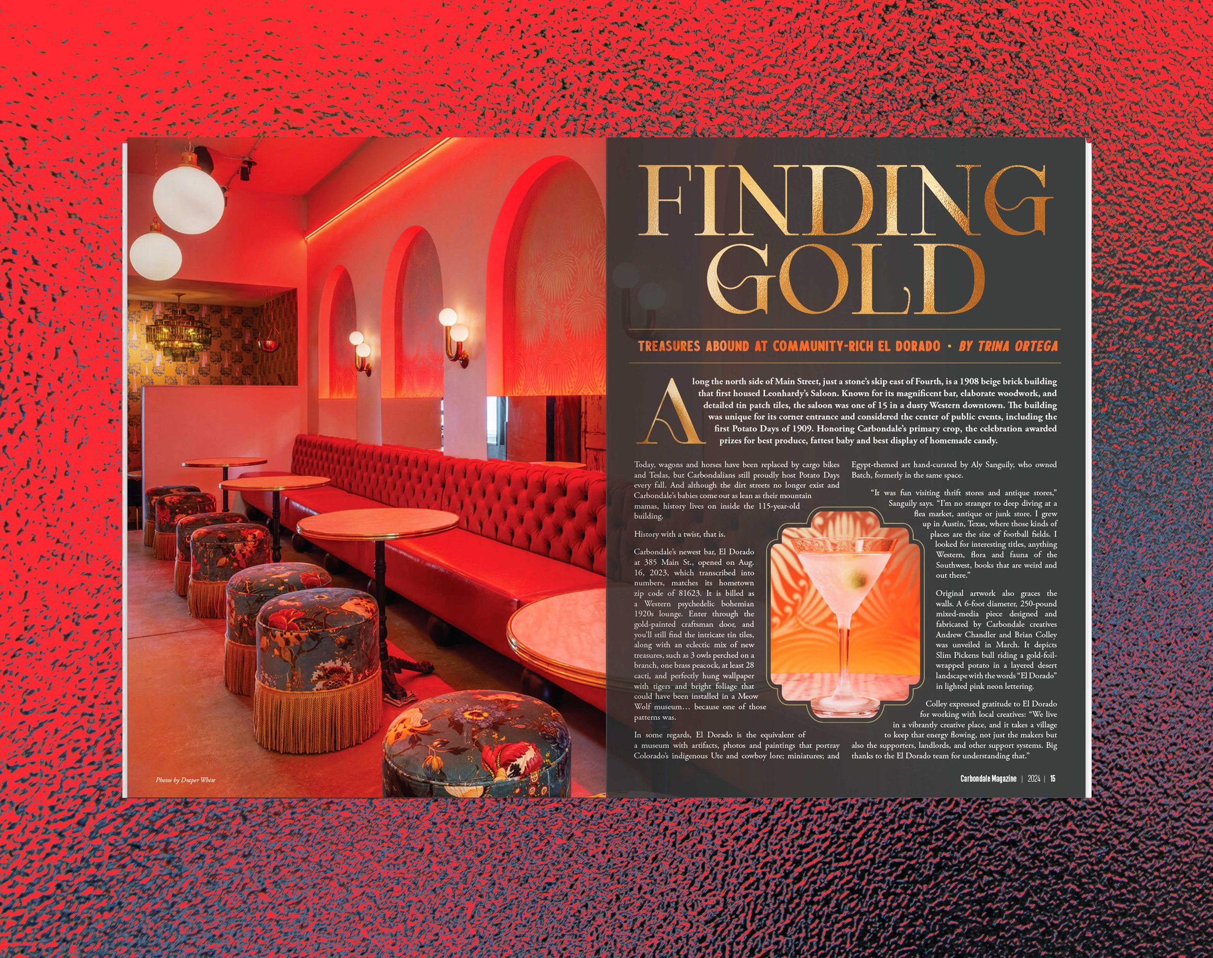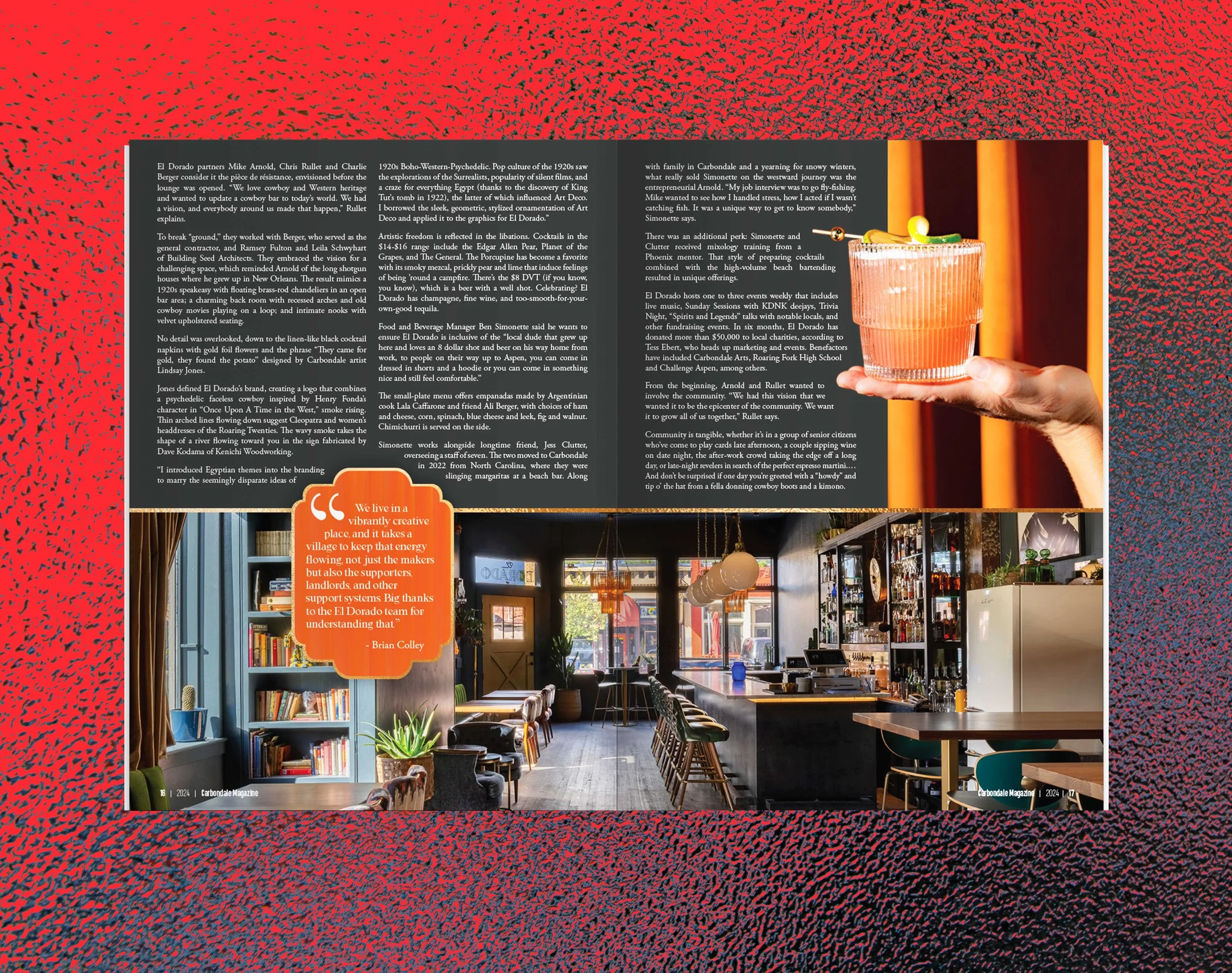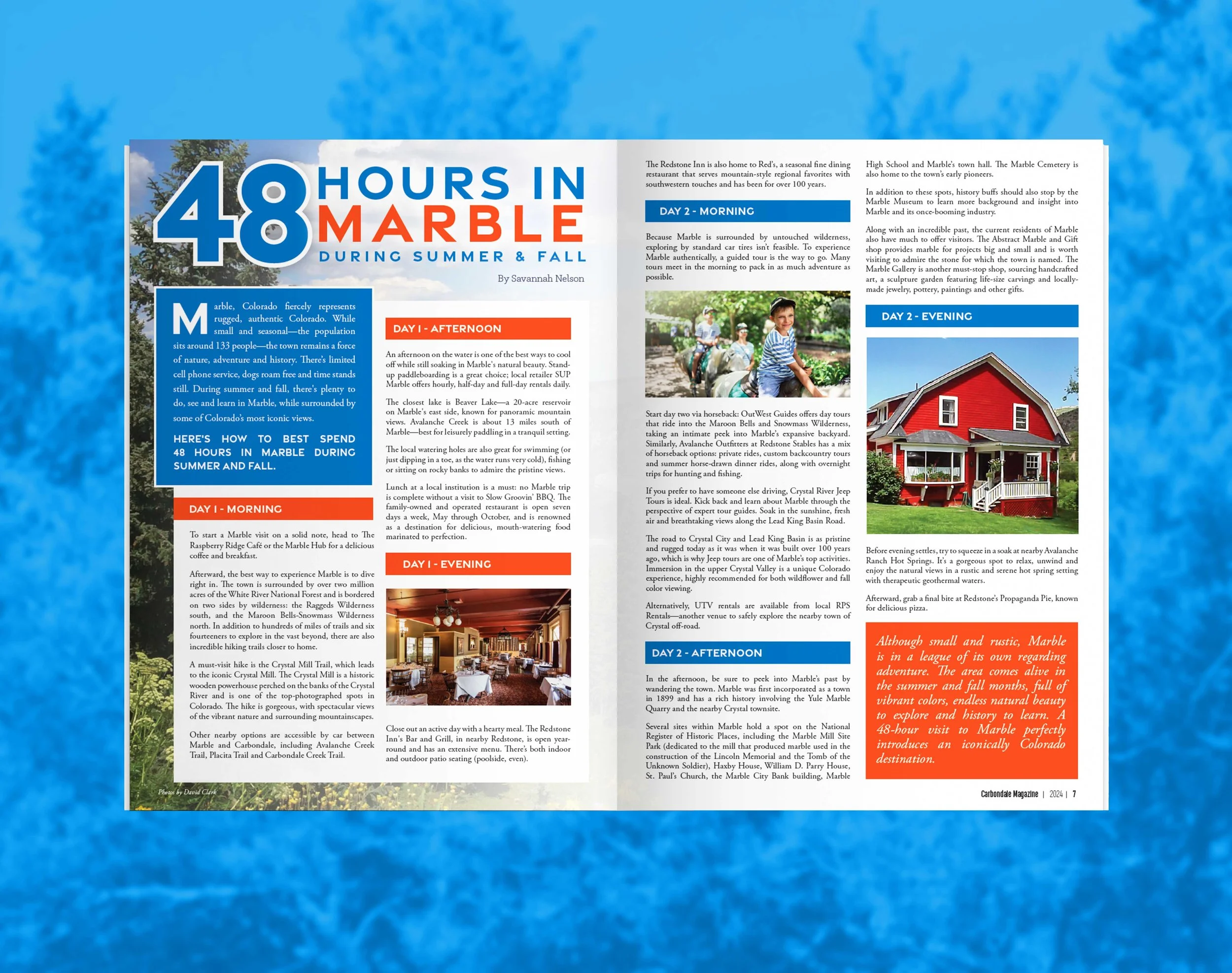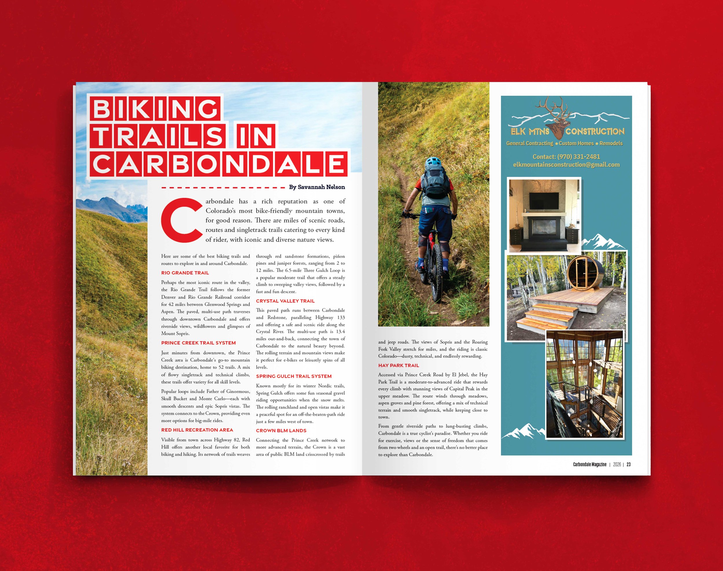

Carbondale Magazine
Art Direction & Editorial Design (2023-Present)
Carbondale Magazine is a regional publication centered on community, place, and the culture of the Roaring Fork Valley. The work focused on translating that sense of place into a visual system—one that felt open, grounded, and connected to the landscape.
My role involved designing feature layouts and editorial spreads that balanced strong imagery with clear, readable typography. Each piece needed to support the voice of the story while allowing the visuals—often rooted in environment and local life—to lead.
The approach emphasized restraint and rhythm: letting moments of space, scale, and image carry meaning, while maintaining a consistent structure across the publication.
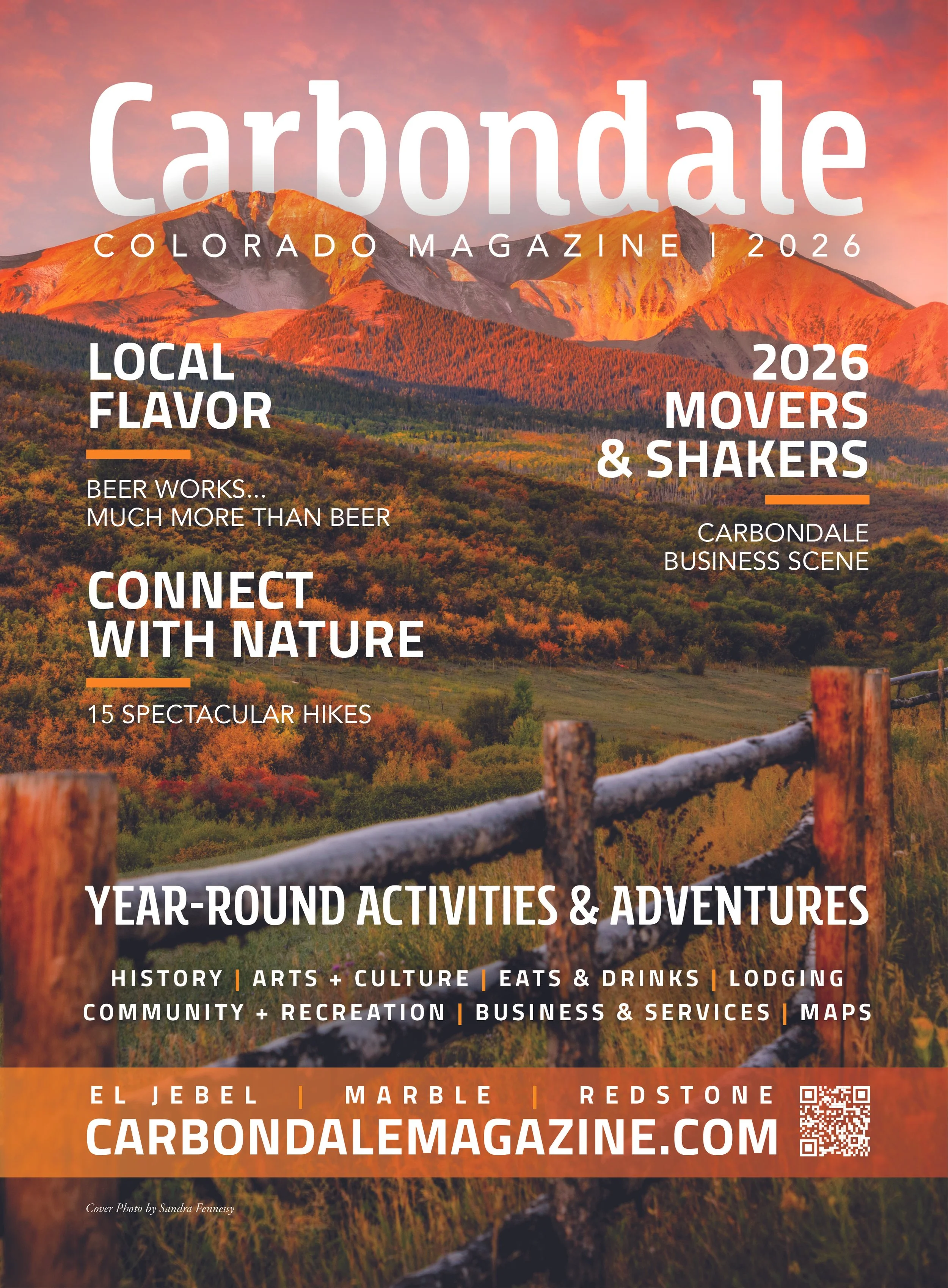
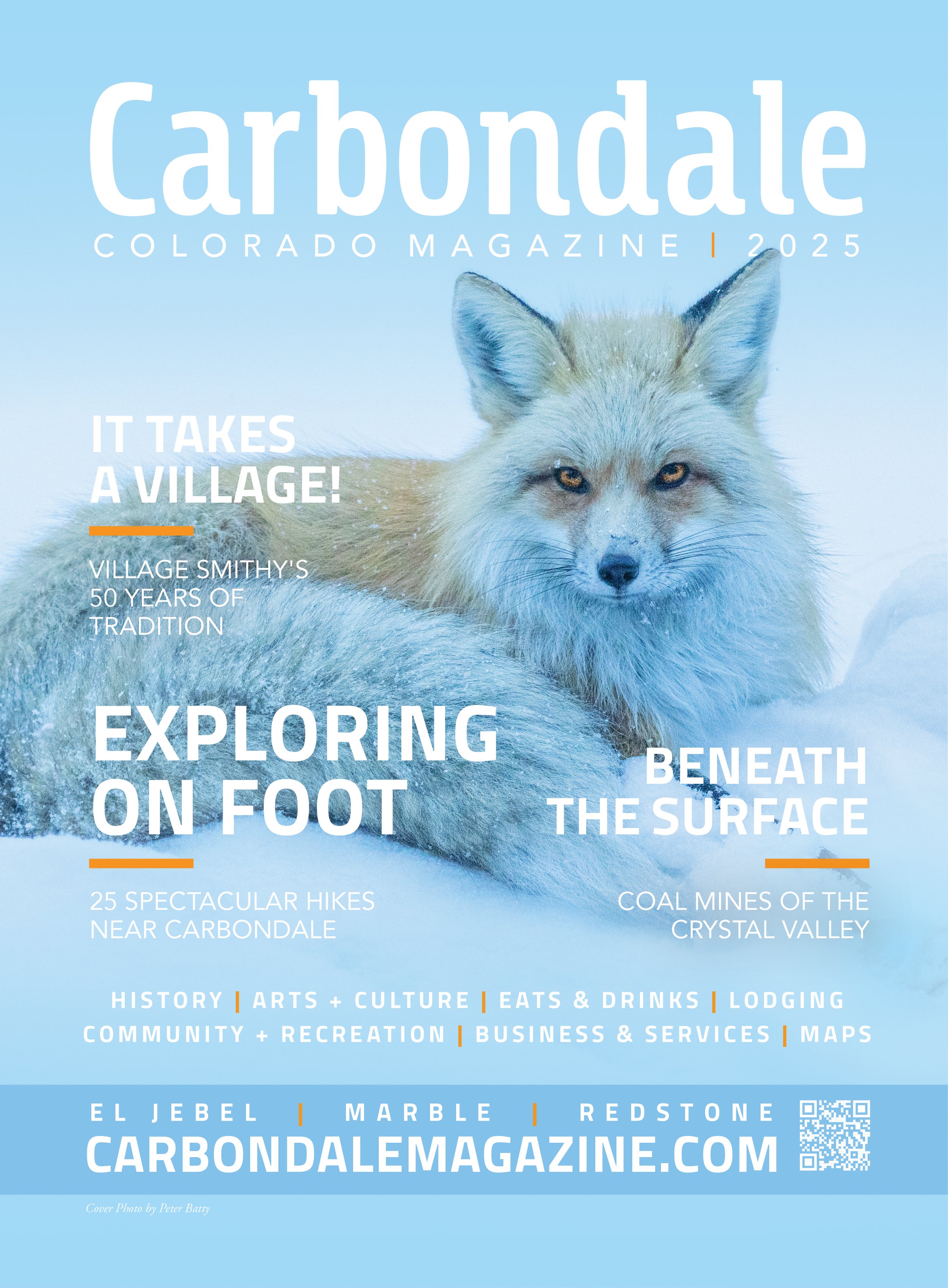
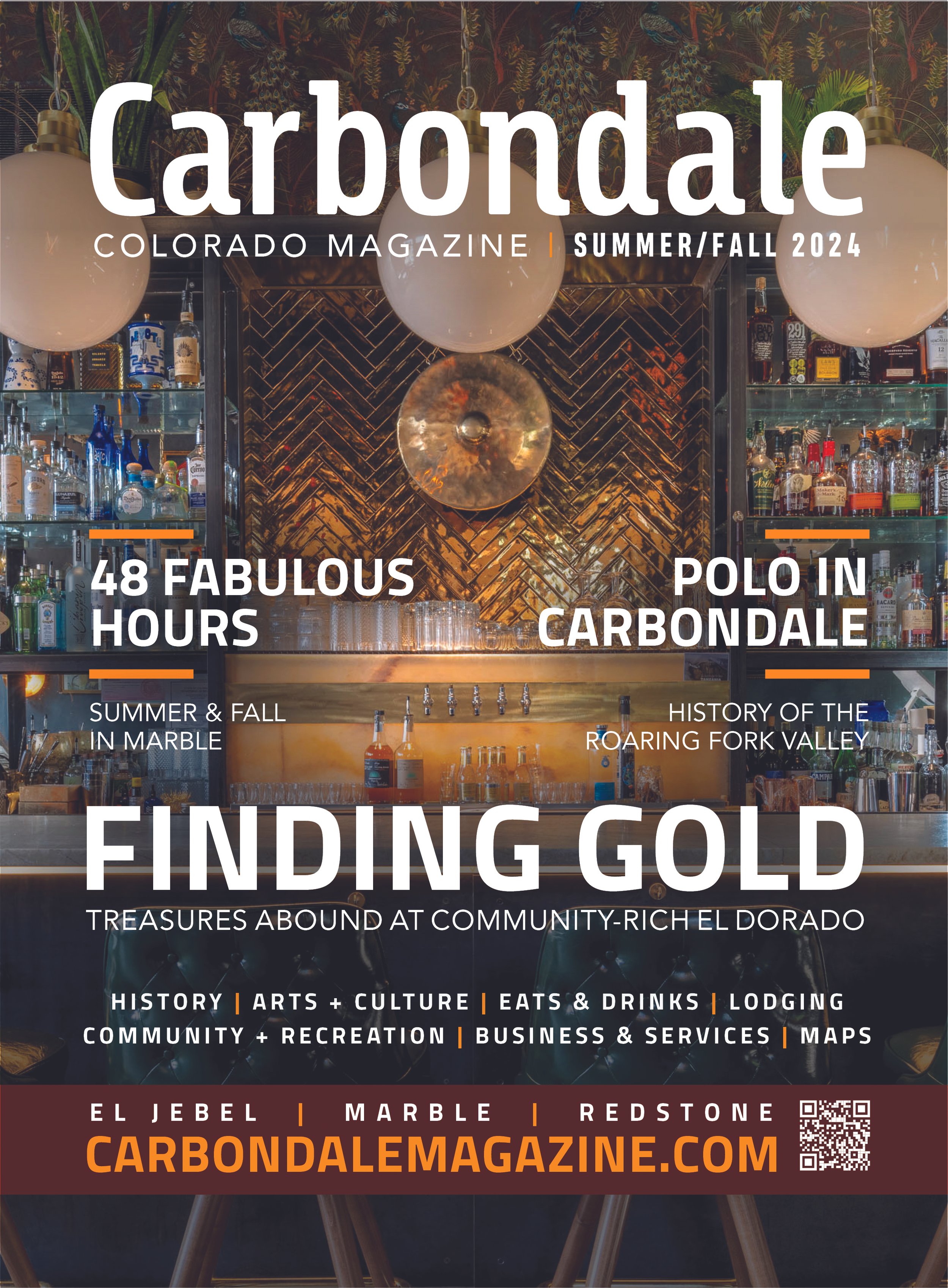
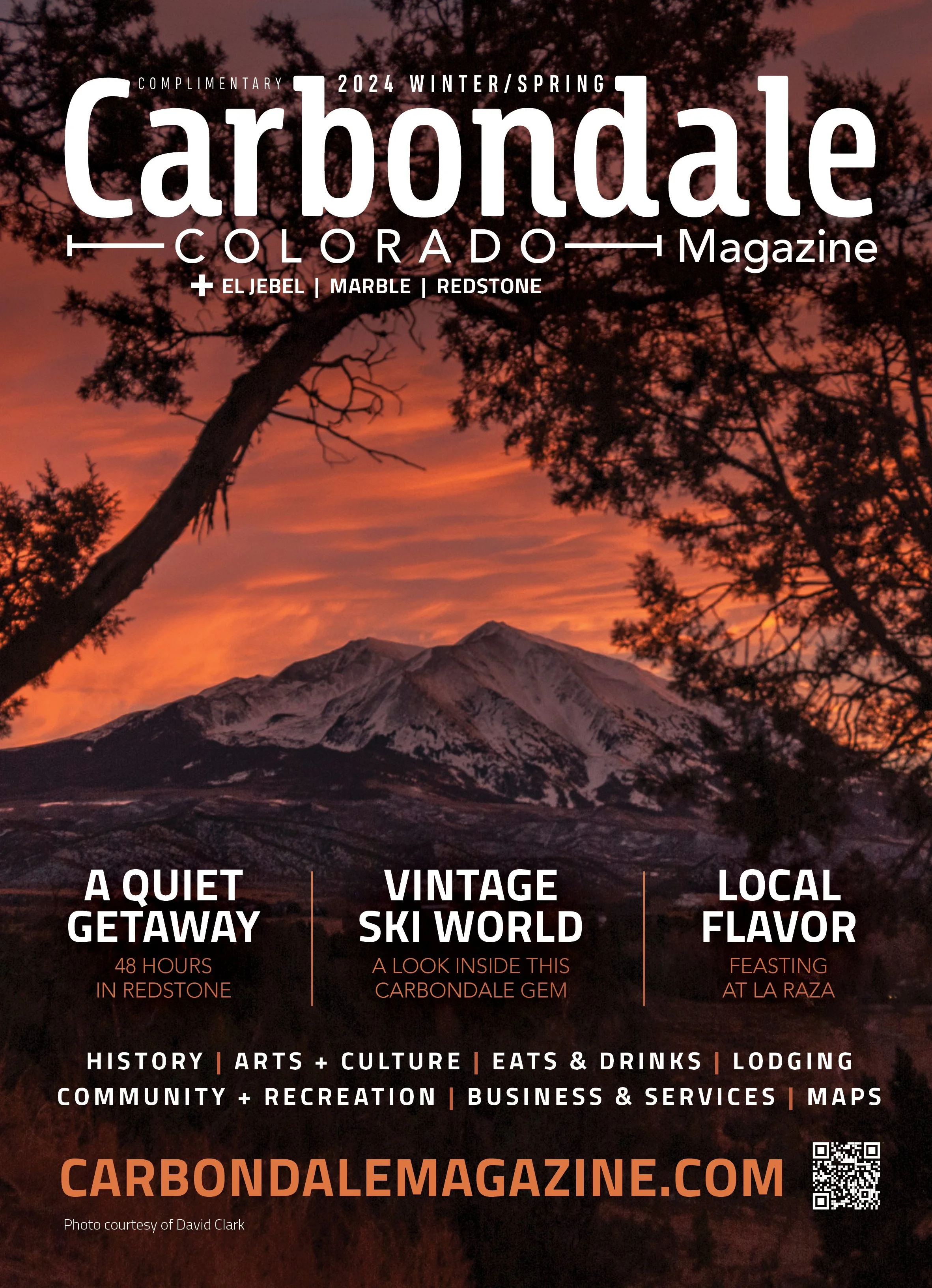
Covers
Cover concepts focused on capturing a sense of place—often relying on strong photography and minimal typography to let the environment speak for itself.
The goal was to create covers that felt both specific to the region and visually compelling, using composition and hierarchy to draw the viewer in without overcomplicating the message.
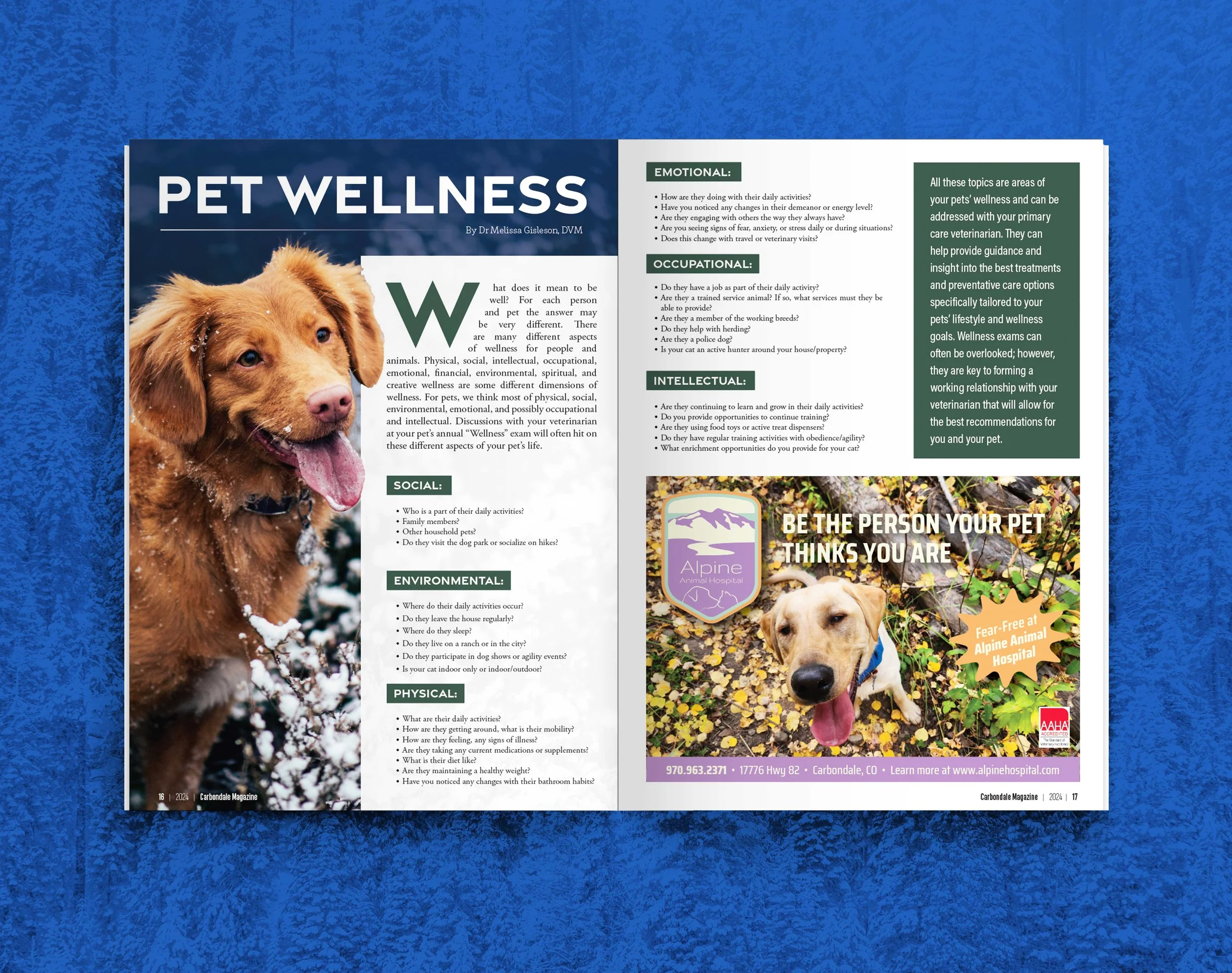
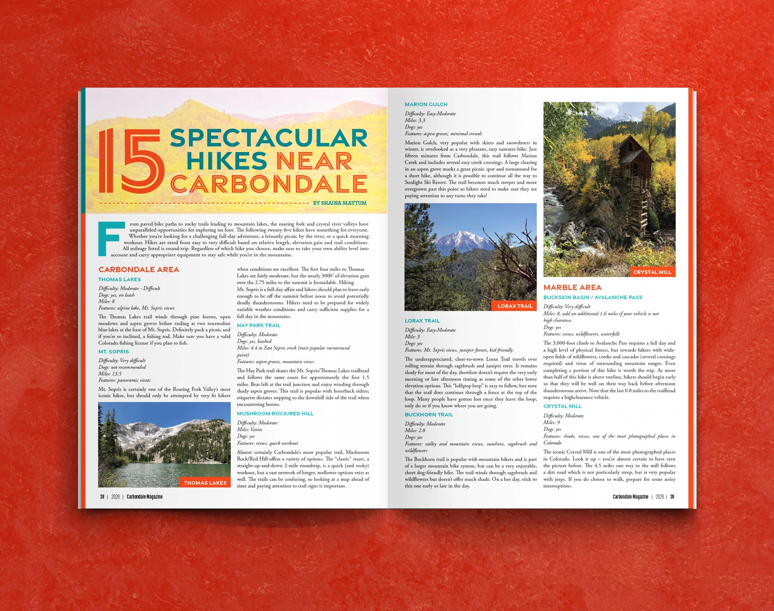
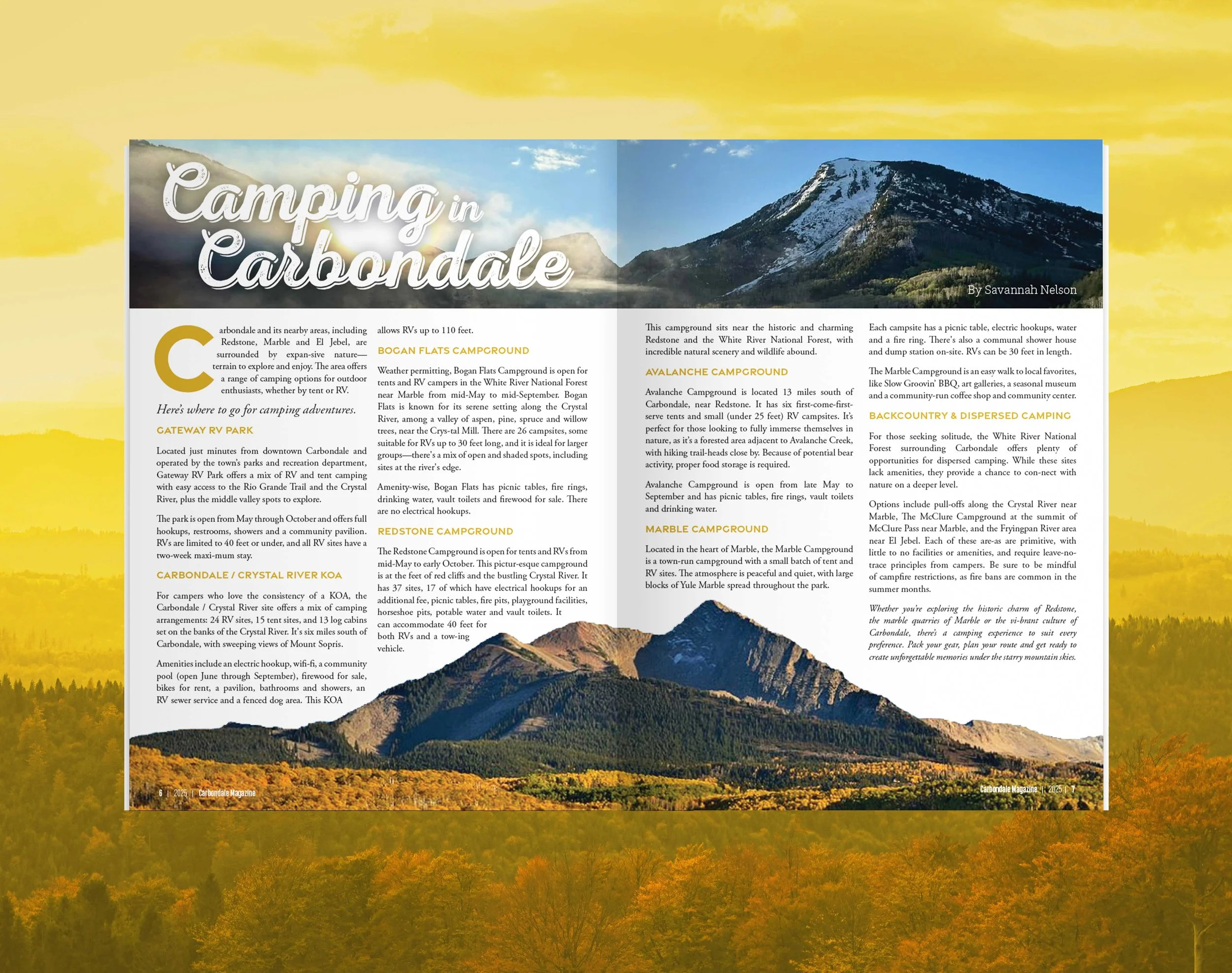
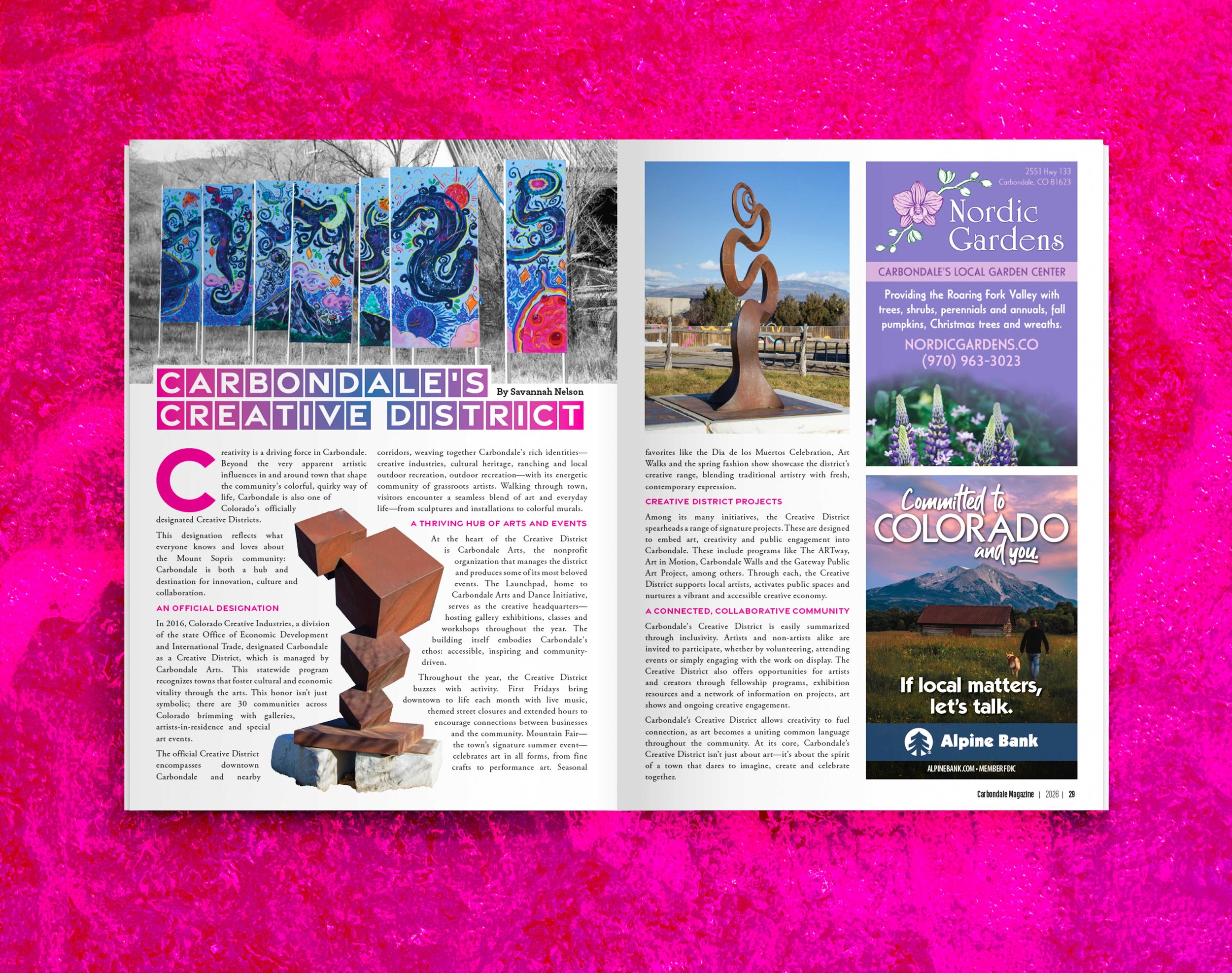
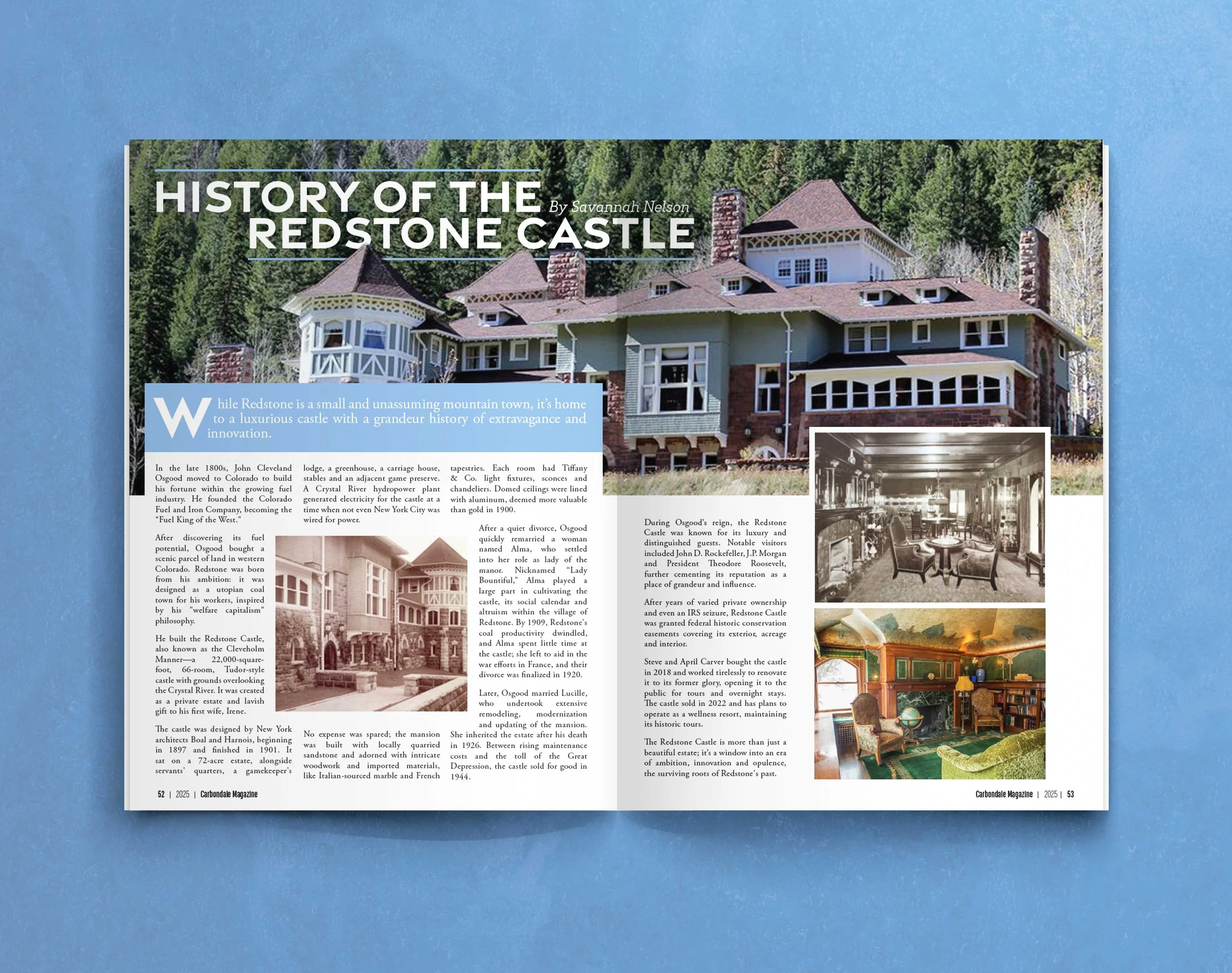
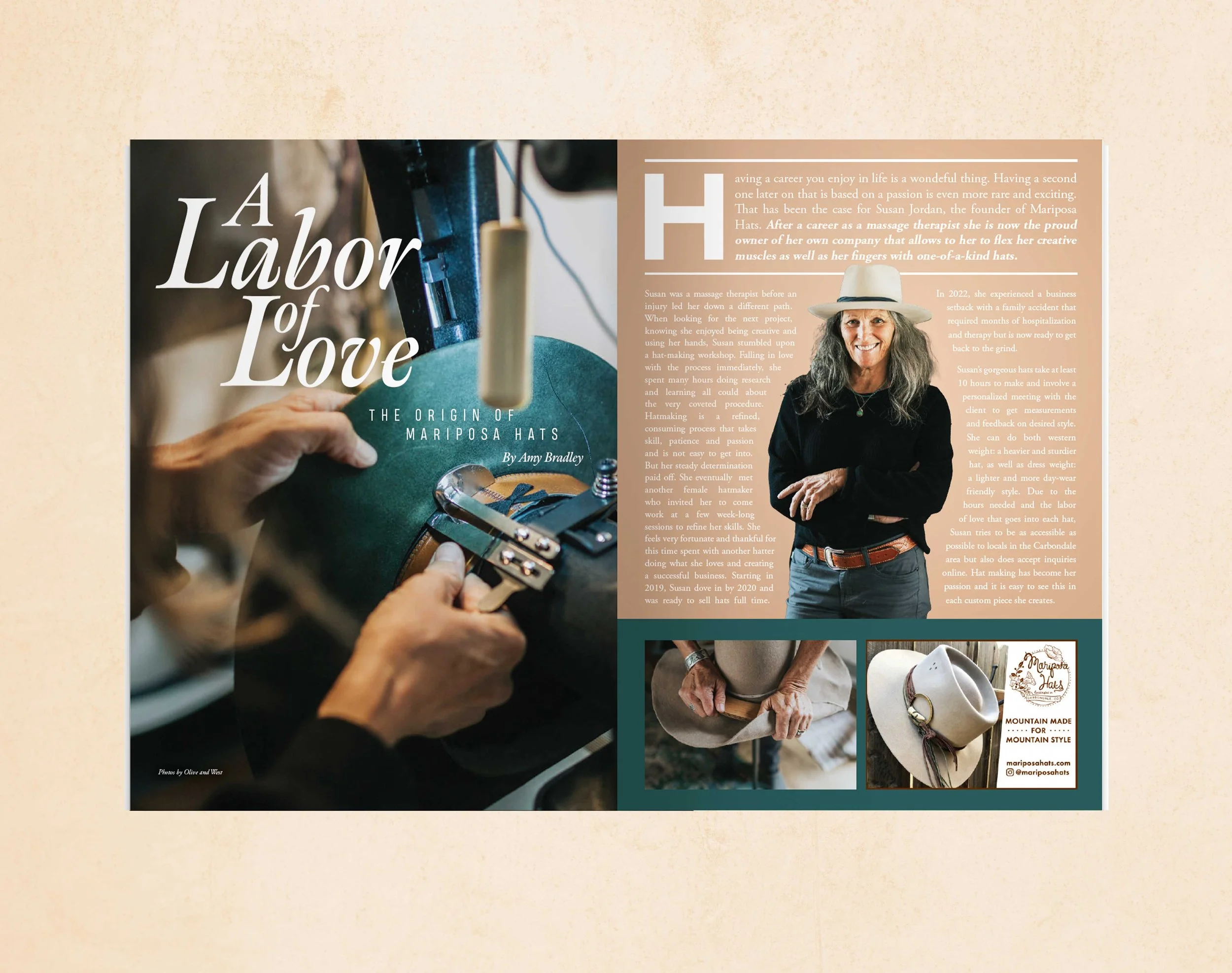
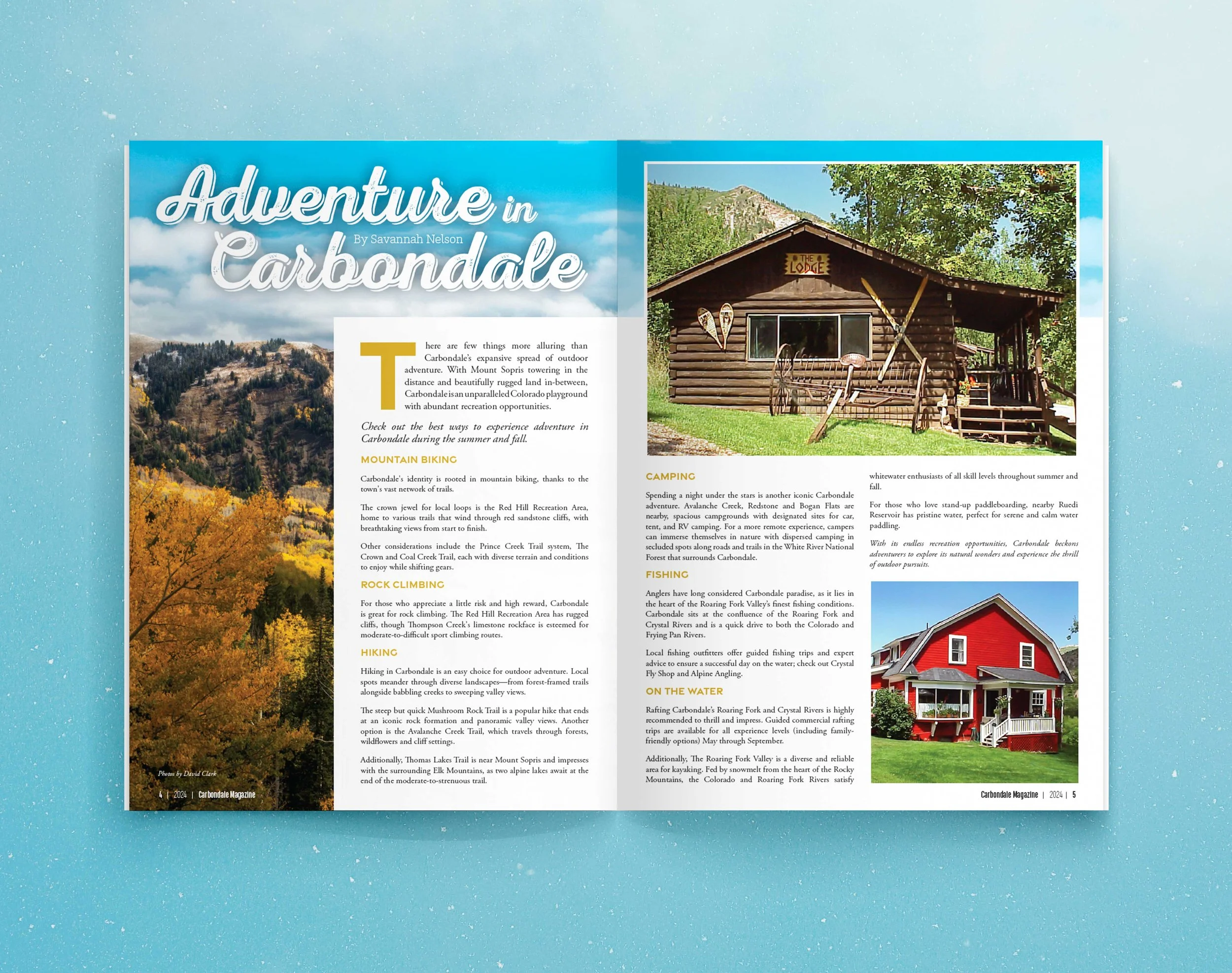
Story Layouts
Editorial layouts were designed to reflect the tone of each story while staying grounded in a cohesive system. With a strong emphasis on photography, the layouts often allowed imagery to lead, supported by typography that was clear, quiet, and intentional.
I focused on pacing and structure—how a reader moves through a story across multiple pages, and how shifts in scale, spacing, and composition can create a sense of flow.
The goal was to create an experience that felt immersive without being overwhelming—giving each story room to breathe while maintaining clarity and consistency.