Grindtime Fitness
Brand Identity
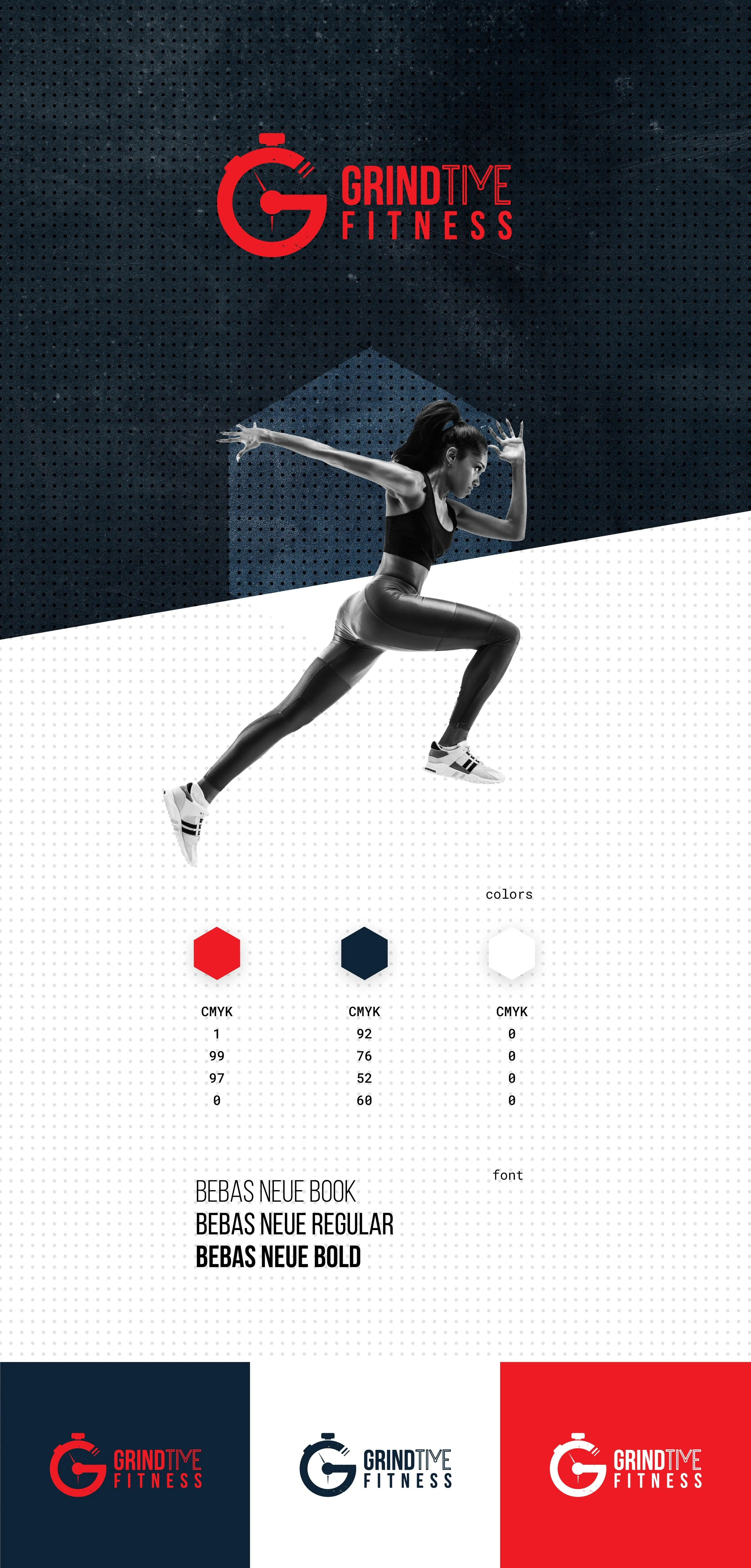
Grindtime Fitness is a performance training brand focused on speed, agility, and discipline across every sport. While working at Creative Advertising, I developed the visual identity for the brand, including logo design, typography, and a bold visual system intended to reflect intensity, motion, and athletic precision.
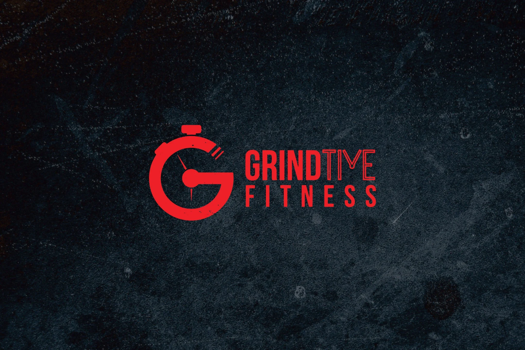
The identity centers around a custom “G” mark that suggests both forward momentum and continuous effort — a visual nod to the relentless mindset behind high-performance training. A stark red, black, and white palette reinforces the brand’s high-energy personality while maintaining clarity across both digital and physical applications.
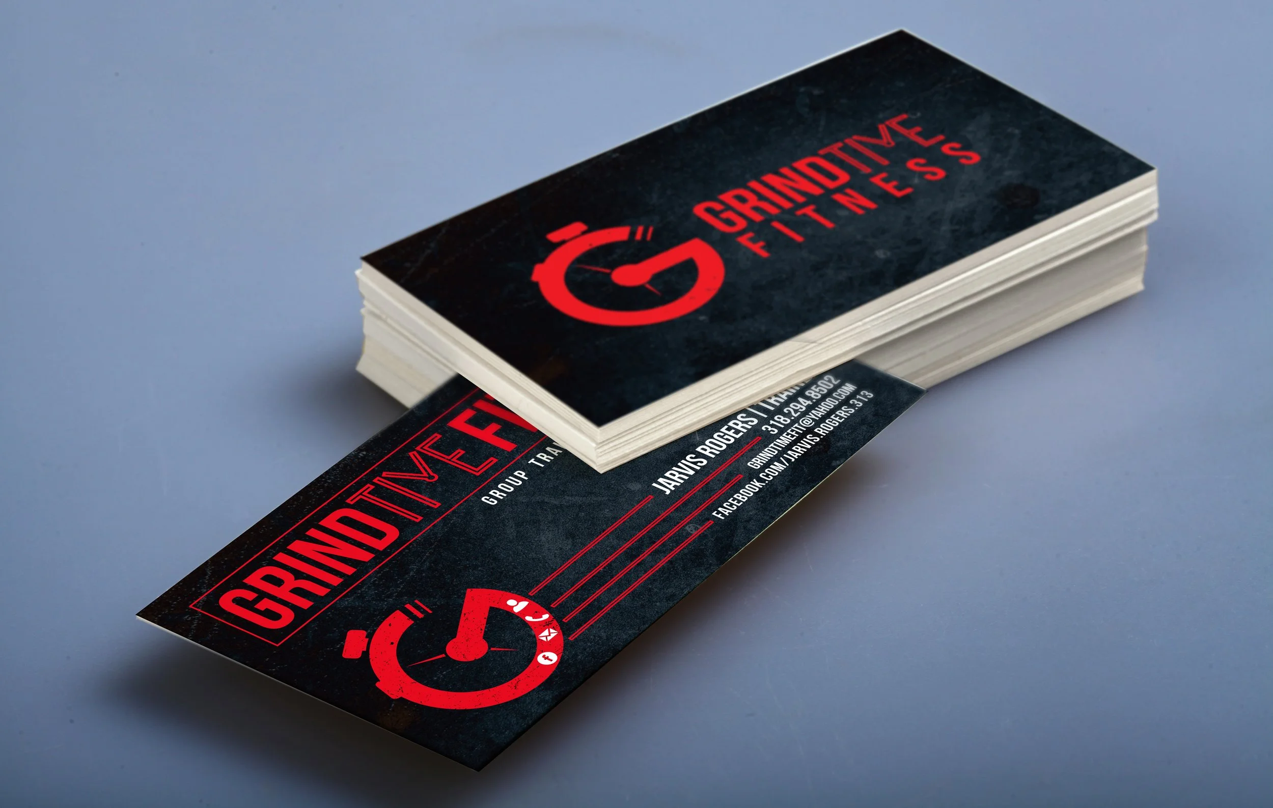
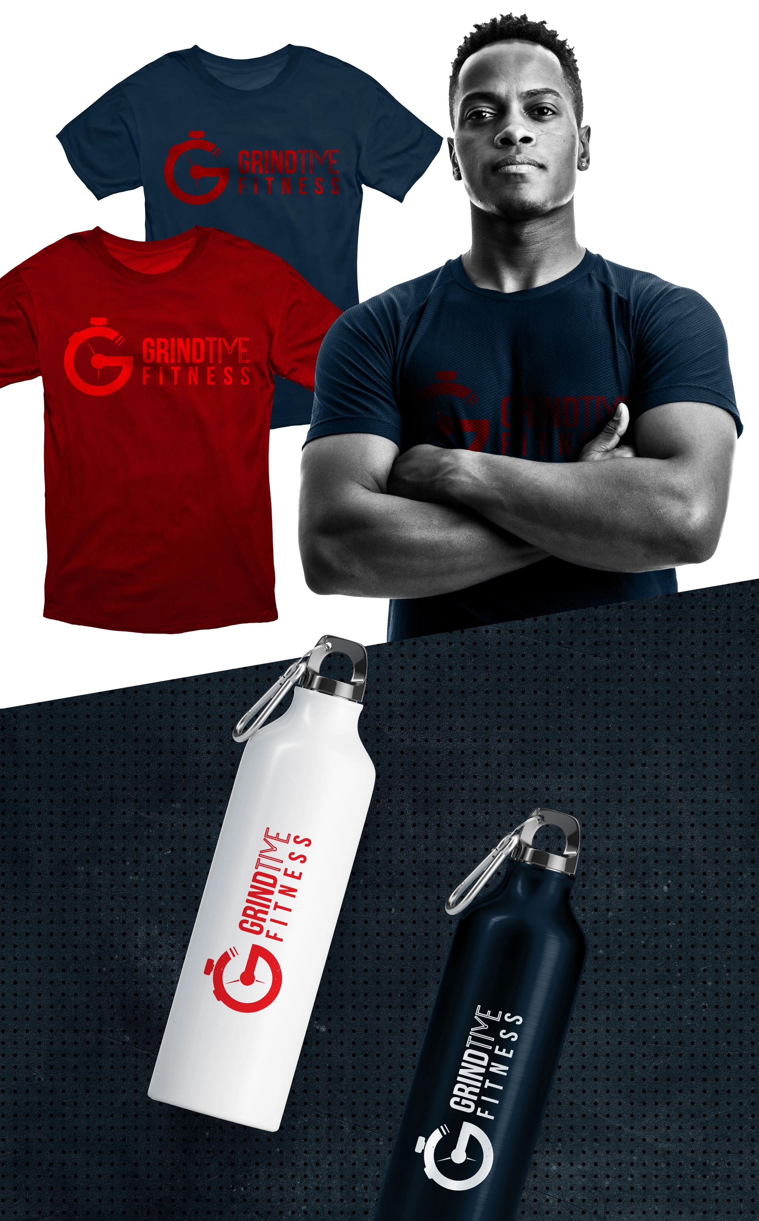
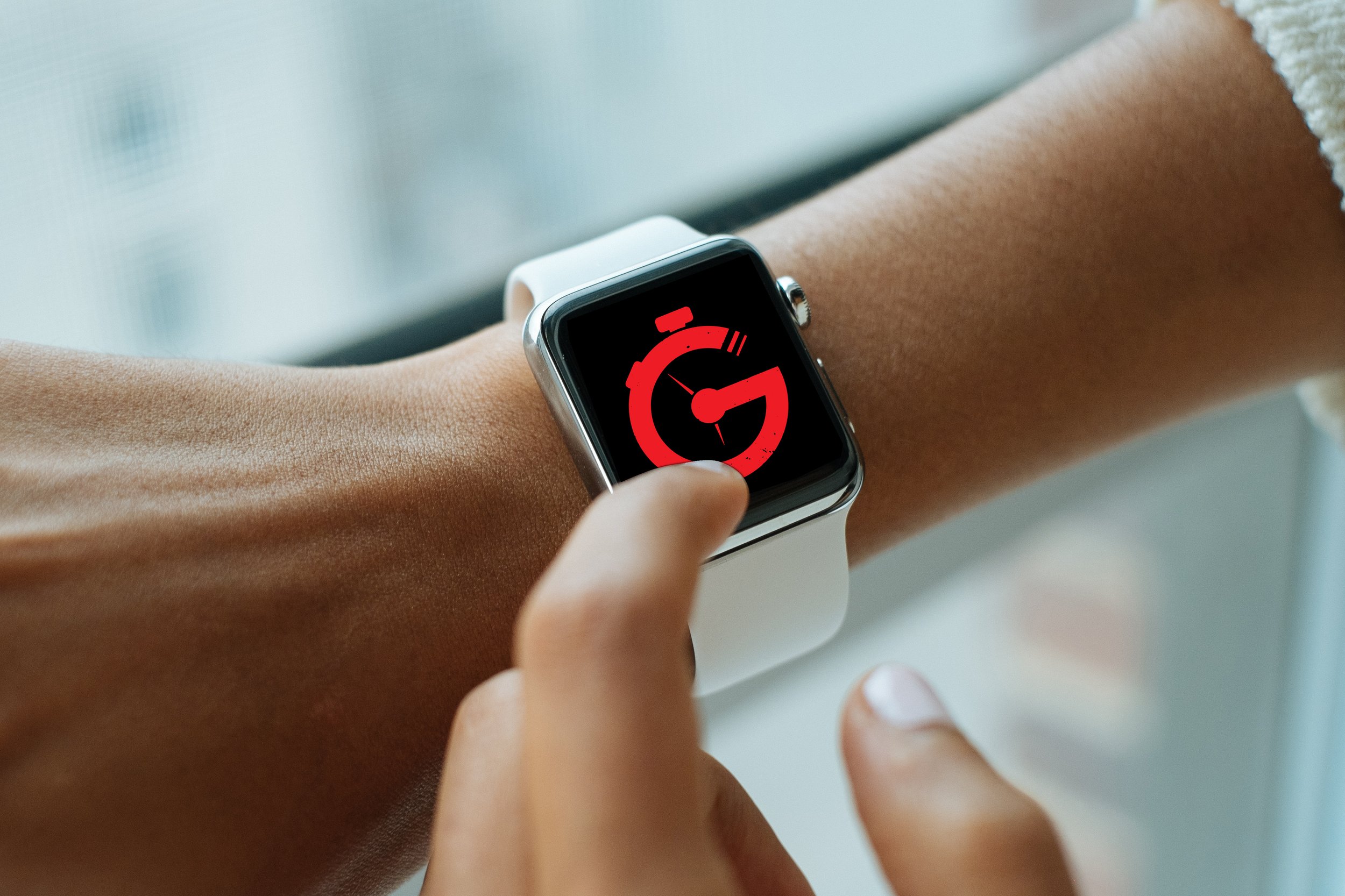
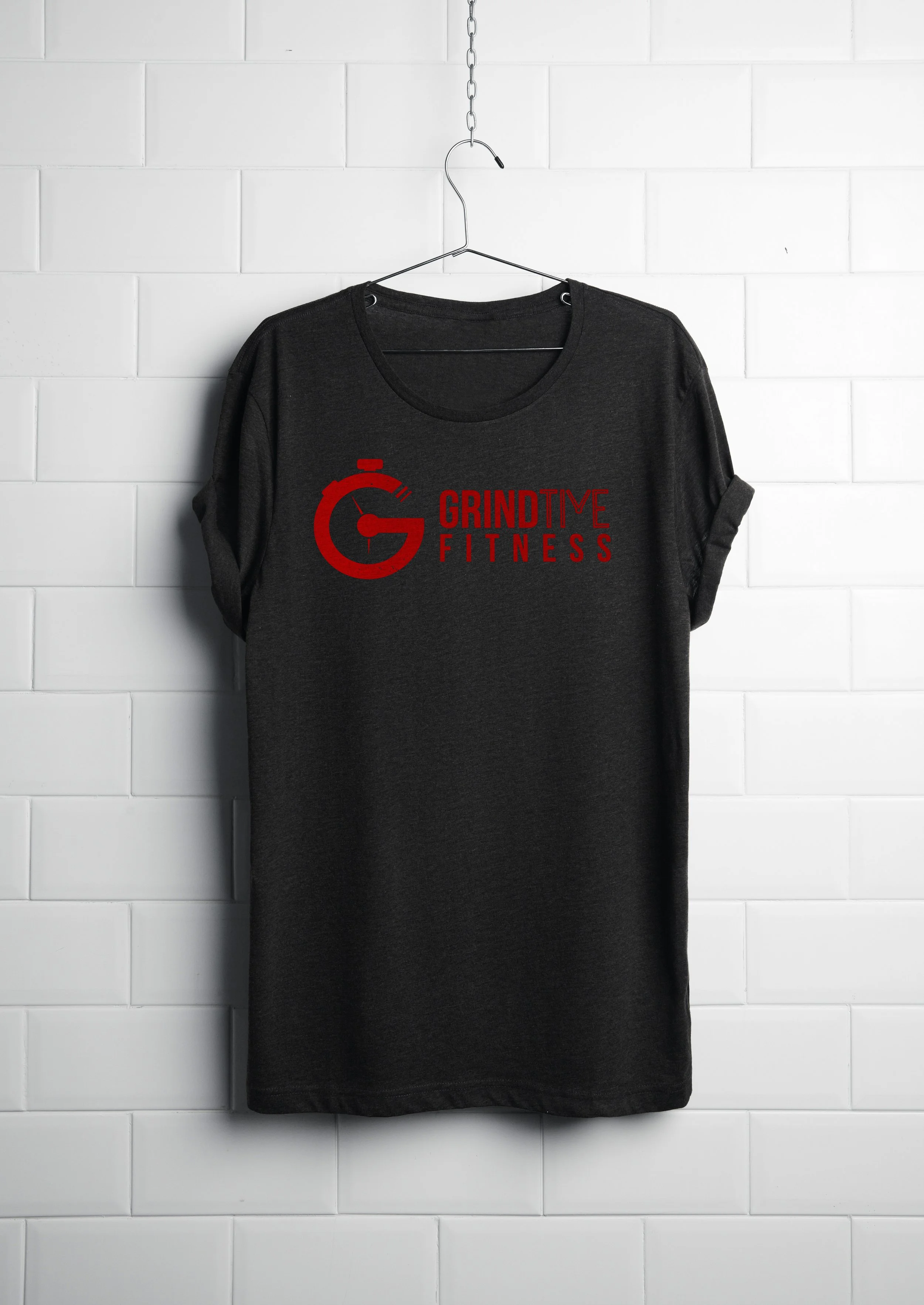
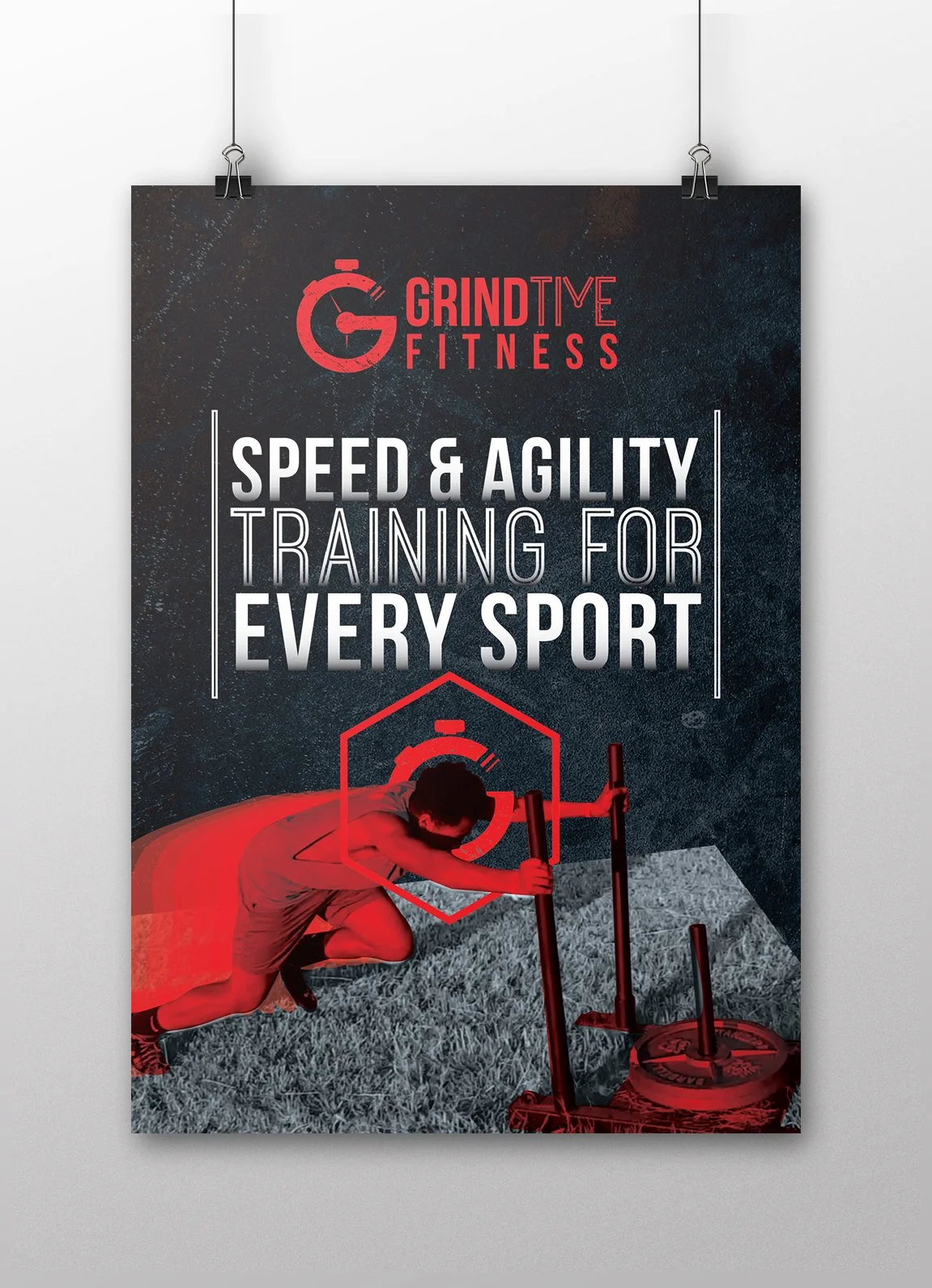
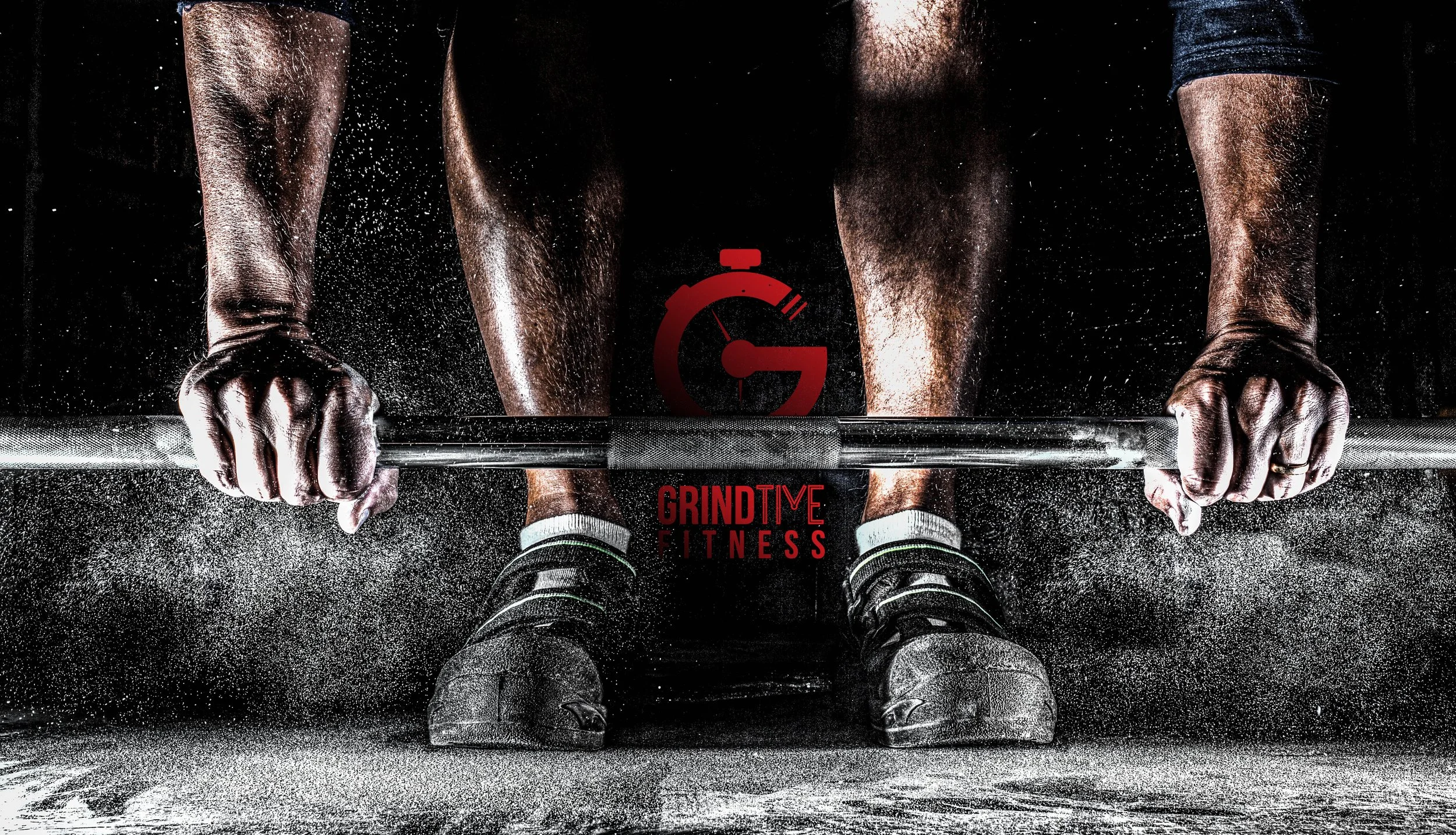
Beyond the core logo, I expanded the concept into a flexible brand system applied across merchandise, marketing materials, and digital interfaces. The result is a cohesive identity that translates easily across apparel, print collateral, and promotional graphics while maintaining a strong, recognizable presence.
Project Scope
Brand identity design
Logo and mark development
Typography selection and visual system
Apparel and merchandise design
Marketing collateral
Digital interface applications
Brand mockups and presentation materials