I found a font I really liked and accidentally redesigned my entire life
This was supposed to be a simple site update. It was not.
It all started with a font, like all fairytales do.
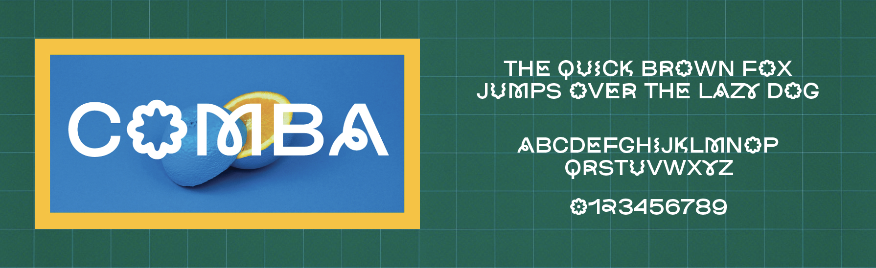
I was midway through a site update, adding work from the last few years to my portfolio (which is basically all my site had become but more on that l8er) when I stumbled upon her. Comba: a sans serif with a funky twist. I was struck by her whimsy, and I simply couldn’t stop myself from entering the lab (InDesign) and beginning my sick, sick experiments.
My site at the time was like those of many graphic designers—minimal, a bit bland, very much “a blank canvas so the work can speak for itself.” And no shade to that approach, it worked for me for a long time. But something had shifted in the last few years. I was laid off from a company I’d worked at for nearly a decade, and in a matter of weeks I decided to pack up my life and move across the country to a city I had never visited. I quickly found myself outside my expected routine and thrust into surprise and chaos. I landed a job at a gift shop, a local relic that happened to be the same age as me. I started there when I was 34 and almost made it to 36 before I left. (This is starting to feel like the life story at the beginning of a recipe, so I’ll cut to the chase. Also, this isn’t a recipe, so no cookies at the end for good behavior.)
I had built my site to be a portfolio for job hunting, but during my time at the gift shop, I amassed a friend group of bright, bold, colorful creatives, and it unlocked aspects of my style that had always been there, but for various reasons, had been on the back burner.
My life was suddenly colorful and whimsical, so much so that it was a point of concern if I wasn’t a splash of mustard yellow or vibrant blue. Orange sneakers, red socks, plush keychains, purple and green striped tees. I had discovered a love for all colors, even the ones I had proclaimed to hate.
“My life was suddenly colorful and whimsical, so much so that it was a point of concern if I wasn’t a splash of mustard yellow or vibrant blue.”
When I moved into my new apartment last July, I threw out all the rules I had previously adopted about what an adult’s home should look like. I wanted my space to be fun. I was so desperate to have wonder and magic and joy in my life, I couldn’t bear the thought of minimal or beige or safe
So the day I found that silly little font that somehow encapsulated both the structure and clarity of a sans serif and the whimsy of something ill-fit for a board meeting—dormant embers sparked.
It was time for something new.
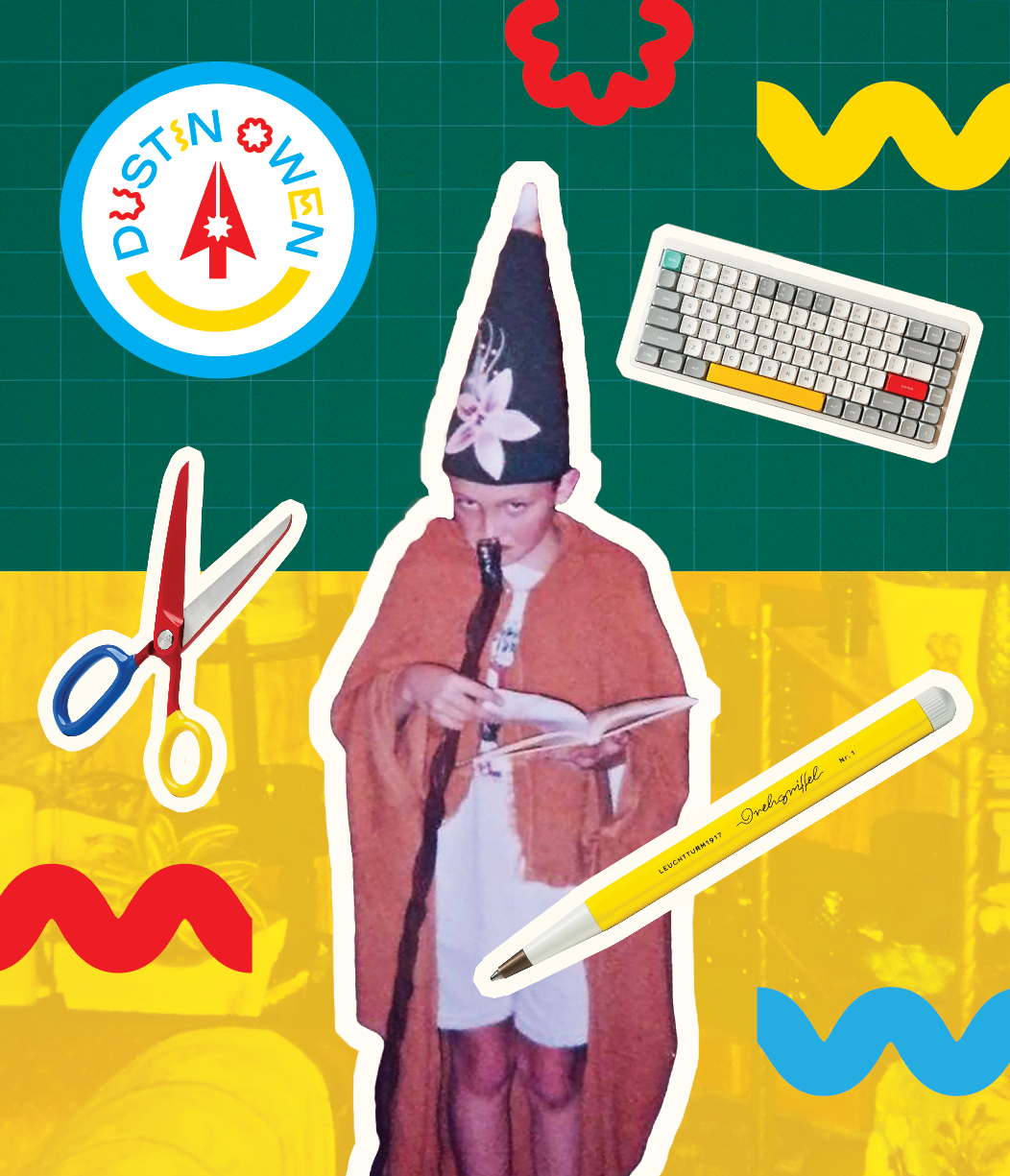
After some trial and error, I landed on something I adored. A feeling I hadn’t had for my personal site or branding in a very long time. I was excited about it, so I followed the feeling all the way to the beginning. To the younger version of me who had—through total happenstance—become my anchor. The one I made everything for, the only person I was truly ever trying to impress.
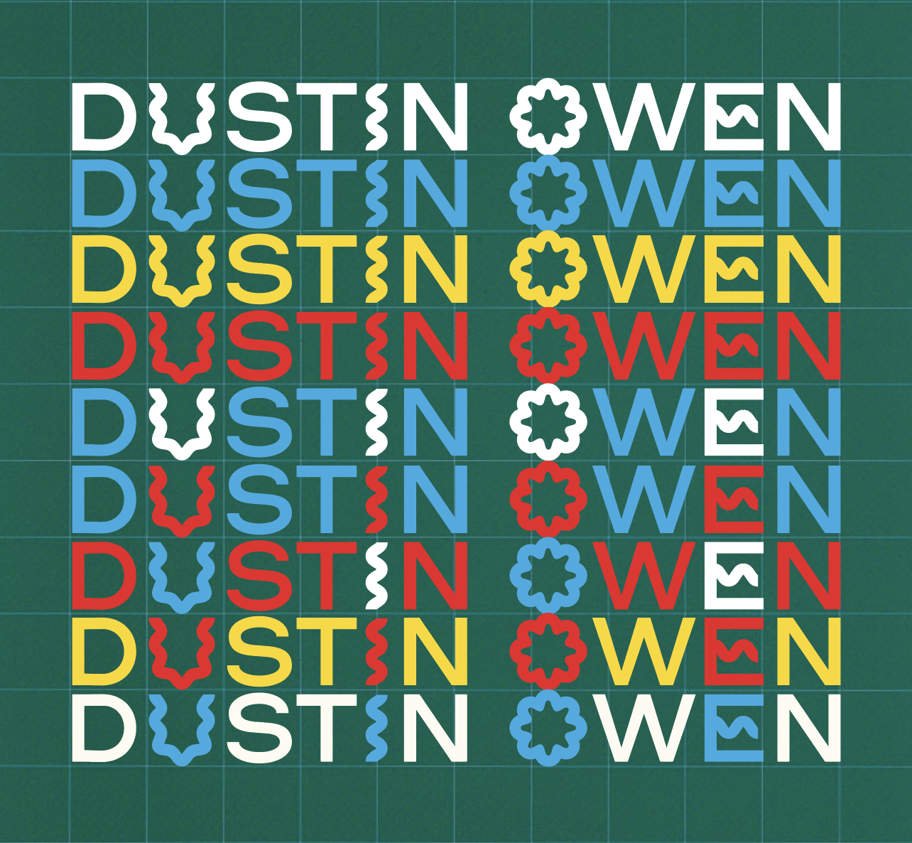
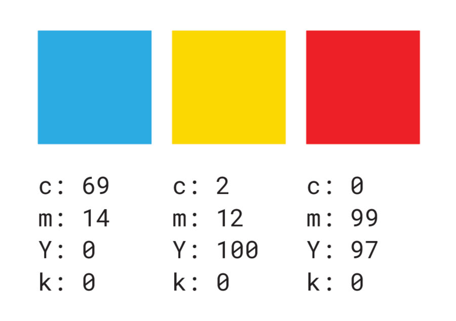

I was armed with a wordmark and a set of primary colors, but I needed a logo mark. I was itching to distill this moment and the associated elation into a graphic. So I asked myself some very tough questions, that ended up taking far longer to answer than I anticipated. The questions… in question:
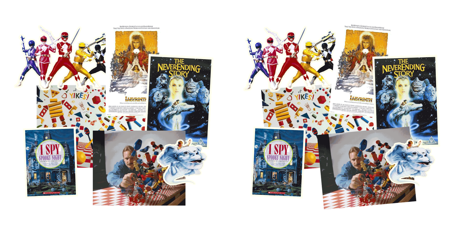
What inspired the younger version of me?
I was (and still am) obsessed with anything Tim Burton, Jim Henson films, The Neverending Story, I Spy books (love you Walter Wick my actual hero), Power Rangers, Practical Magic, KaBlam! (potentially personally responsible for my love of collage and stop animation), Rugrats, and much more. Once I started to draw parallels between these interests, I was left with a clear list of elements: bright color, texture, tactile, magic, whimsy.
If no one else ever saw it, what kind of work would I make?
I’ve always struggled to find a shape for all my interests, often just focusing on my design work and letting my other endeavors live on my computer or in the ether. So I took the time to review all my work—literally everything I’ve made from the last 16 years—and thankfully it all fell cleanly into three categories: writing, design, and studio work (which tends to be weird and witchy.)
Putting it all together
Back from my reflective deep dive into my psyche and my past, I had all the pieces I needed. A wordmark, a color palette, and key elements primed for fusion.
From the little fairy boy in his room making Lego blueprints and wands from taped-up sticks:
color + magic + whimsy
From the millennial creature typing this post, ready for something bold and new:
writer + designer + witch
I began with the three facets of focus I wanted to work within—writer, designer, witch—crafting symbols for each: a pen nib, a cursor, and a wand. Almost immediately I saw how they would fit together.
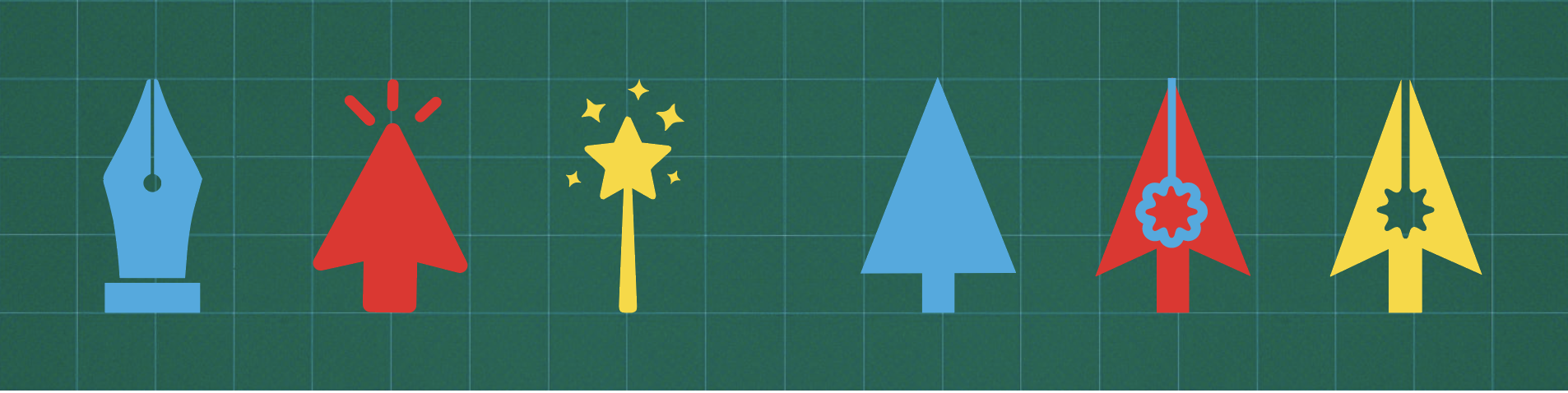
Using the letter “O” from my wordmark for consistency, I built the ink well of the nib that functioned as a hidden wand. It was so simple I almost overthought it into deletion, but sometimes you just crack the code on your first go. And not to get too deep (post coming later that will scratch that itch), but sometimes what feels like a quick solution is years of subconscious tinkering. That’s what this was for me. Ideas sitting in the web of my mind, finally ready to merge.
“… sometimes what feels like a quick solution is years of subconscious tinkering. That’s what this was for me. Ideas sitting in the web of my mind, finally ready to merge.”
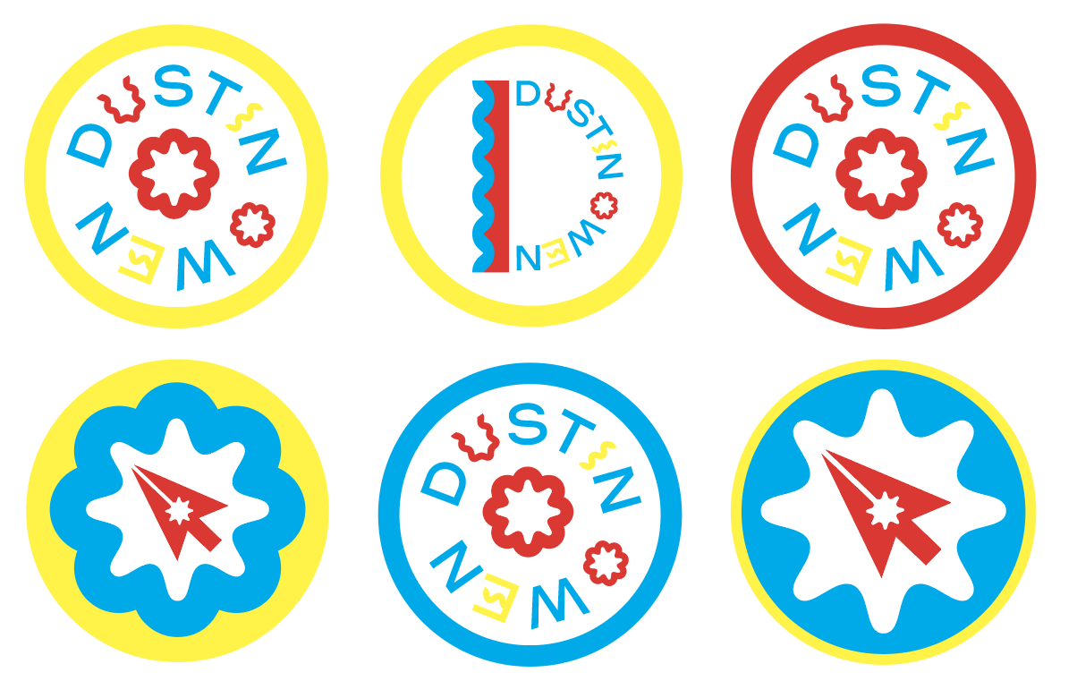
The next step was play!
Color, magic, whimsy. I went bold, really pulling from those early inspirations, and liked a lot of these iterations. I sat with them for a while, tweaked things, didn’t look at them for a few days. After some distance and outside opinions, I landed on this.
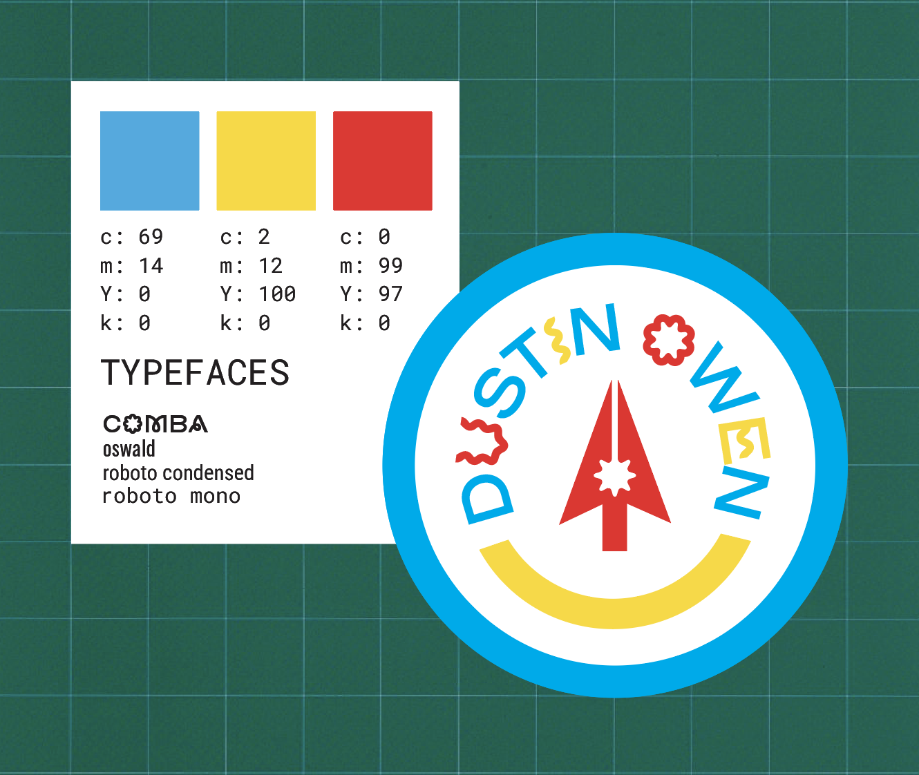
A twinge of ‘90s, a pop of primary colors, the suggestion of a smile, and an overflow of whimsy.
And suddenly I had something that married what I loved, where I was headed, and who I was becoming. Something that delighted me to look at. Something that I was very proud of.
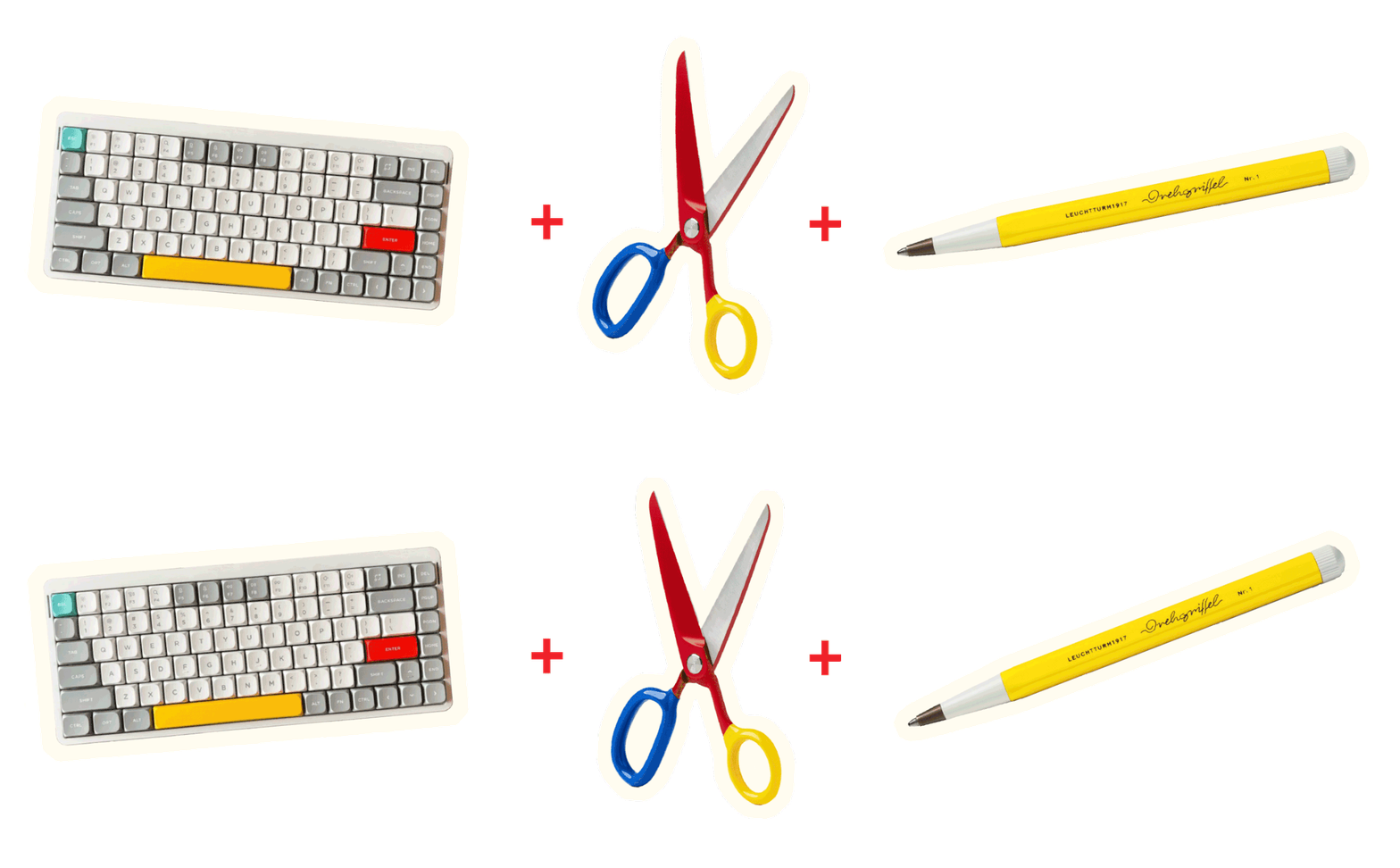
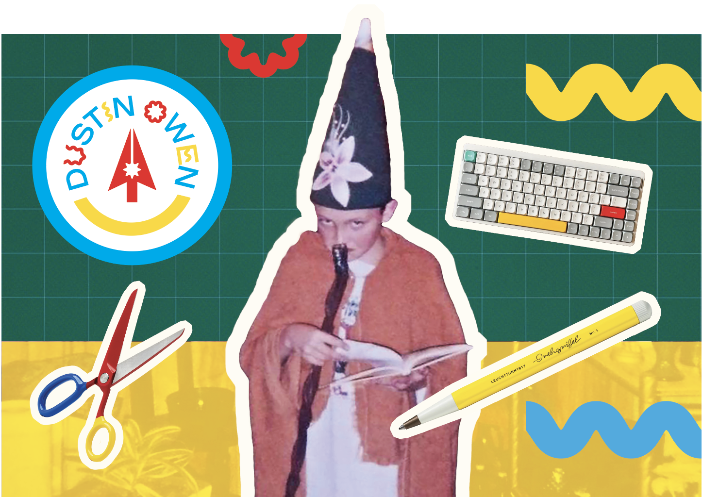
But no witch or wizard is ready for their journey without an arsenal of tools! (Sticking with the whole fairytale theme. Just go with it). I already had my staff and book of magic thanks to younger me. My logo was my shield. My pen was my sword. My scissors… another kind of sword (maybe the metaphor is falling apart a little here) and my keyboard… actually I don’t know if there’s a medieval equivalent. (I just googled it and I’m going with runes! Keyboard is runes, and you know that.)
This turned out to be the easiest part of the process. I started my site redesign from scratch. Clean slate. Fresh look. In some ways I feel like a real adult; in others, I’ve never felt more like a kid at play. That balance is what I’m aiming for with this new era.
What’s next?
So much! I have a lot in the works, more than I expected! I want this space to feel alive. A home for all my creations and interests. A lab for my experiments. A studio where things are being made. Whether it’s poetry, collage, freelance work, or a very weird font project involving worms (stay tuned), I feel like I finally have an ecosystem that will grow with me.
If you’ve made it this far, thank you. And if you haven’t made it this far, then you can’t have any of these cookies. In fact, you’ll never even know there were cookies. It’ll be for us only. ;) Thank you again. I love you.
See you soon,
Dustin